I had to stop and consider this, because it seemed to me that yellow was "obviously" the correct color. And indeed a few image searches confirmed this: a yellow lightning bolt is by far the most universal symbol for electricity, along with the standard black-on-yellow danger icon. I'm not sure how far back in history that representation goes, or what its origins are, but I think it's been used ubiquitously in comics and cartoons for a long time.
To be fair an image search for lightning does look decidedly cyan on royal, with purple, red and more options.
(1) https://www.hse.gov.uk/electricity/nearelectric.htm#signs
I’ve noticed Australians seem to have a similar issue: they decry the Nanny State at home, but all the ones I’ve met abroad complain about the current location being insufficiently nannified. Often both complaints in the same conversation.
Finally: Italians. I thought a trip from Milan to Rome was going to be like a trip through Somalia the way the Italians I know describe their country. In fact, everything seemed to work exceptionally smoothly, although whenever I bring this up I’m told that I simply didn’t venture south enough.
All the things people are saying here about Australians are the same complaints Americans in the west have about Californians.
Freedom for me, but cheering when someone else gets caught by the police when they are breaking the law. It’s an odd dichotomy. I don’t hate it but we do seem to lack self awareness with a slightly English style.
I note a z in organized ...
I do get where you are coming from: My mum used to joke about a fictional sign that said "Please do not throw stones at this sign". Some of our signage is absolutely laughable.
We do have road signs that proclaim: "New signage" or "New road system" etc. The locals know what has changed already and non locals are encountering it for the first time anyway, so why bother.
Across the entirety of the UK, our road signage is pretty rock solid. There may be a few degenerate cases but all sharp corners have chevron warning signs and they do save lives.
I'm not sure it's as absurd as it sounds. Do you look at the signage you pass every day? I suspect I don't.
When they put in a new stop sign near where I live (in the US), things were less safe for a long time because people consistently drove through it without slowing. Since this was not a consistent problem with any other stop sign nearby, I believe it was not willful disobedience but people so used to there being no stop sign there that they literally didn't see it.
(Even with literal neon pennants on it, people kept driving through it anyway, but you'd at least sometimes see people skid to a stop partway through the intersection, presumably as their brains caught up. And eventually it penetrated locals' consciousnesses, and now they stop.)
"Do you look at the signage you pass every day?" - I do and so does my sodding car and it still annoys me when it gets the speed limits wrong!
I accept I'm not everyone and noting and warning about change is a good idea. We do have a lot of signs and I'm pretty sure I've seen signs warning about upcoming signage (not really 8)
I'm happy to report that I've driven in several US states (mostly FL, including around and in Miami and Orlando) and found it pretty straight forward. "Right on red" is pure genius and "four way pass in turn" is not, especially when multiple lanes are involved!
Most signs do not have bullet holes in them. Like, 98/100 signs are holes-frei
Not really. New changes like adding stop signs or converting a one way stop to all way must be conveyed to locals who's muscle memory will send them sailing through.
Happened to me recently, city added an all way stop to a 4-way free for all intersection and converted two intersections from one way to all way stop. I sailed right through the new all way stop the first day - no cop but I caught it as I went through. Missed the big yellow NEW STOP AHEAD too. Almost ran it again the next few times. Now at least 6 moths later I still see that sign and have to think "oh yeah, thats there."
Not entirely accurate? Non-locals may visit the area often enough that they're familiar with the area but will not necessarily be familiar with local changes.
(eg parents visiting from another part of the country every few months)
I think high school English in my country is officially British English, but practically we all learn from reading American media.
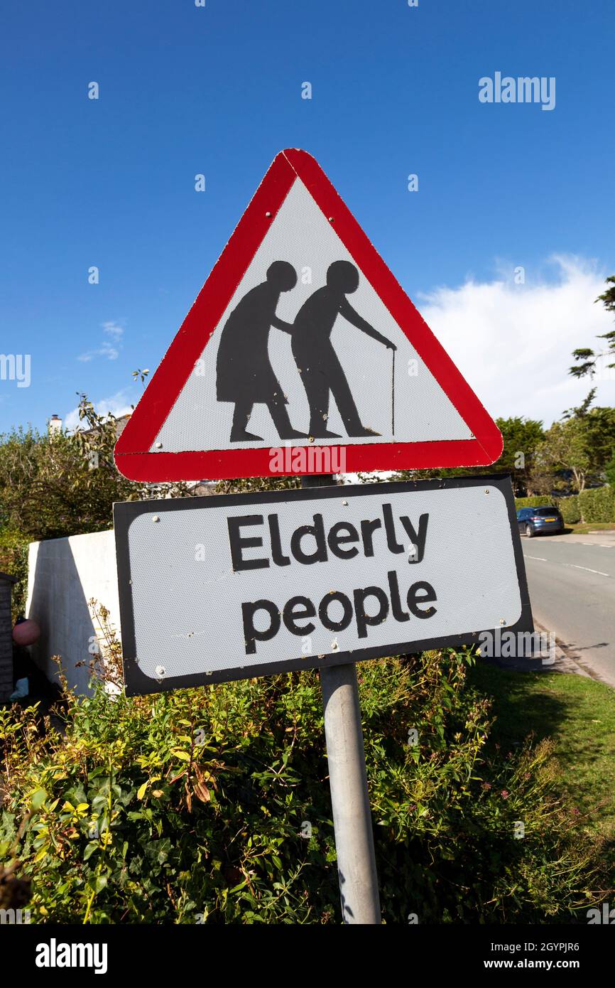
The first time I saw one of these I stopped to take a picture. It just seems the most ridiculous thing to warn people about, as if somehow "elderly people" can't cross the road.
I don't understand this mindset. Do people not walk where you live, or do you not have elderly care homes? I've been to _multiple_ countries and nearly all of them with some uniform signage standard warn motorists about elderly and children crossing.
You might consider them redundant because elderly people can also cross the road where there aren't any signs, but then few warning signs aren't.
https://gpm.nasa.gov/education/articles/shape-of-a-raindrop
Iconography is a language, and terms in a language aren't usually exact representations of what they stand for.
Dunno why you'd use anything else.
You decide!
[1] https://www.os2world.com/wiki/index.php/ZOC
(The Wikipedia page for the application does not have the same splash screen that the above link does and the above is certainly the version I remember.)
I think he has just forgotten that in the late 90s, these color choices were entirely obvious and followed the Windows design precedent, which is why he probably didn't think much about it at the time
It was Pournelle that inspired it? Really?
> The Neo-Latin adjective electricus, originally meaning 'of amber'
Seems like electricity and amber have been tied together for a long time.
This rules out the idea it comes from safety signs. I also dont buy the safety sign origin as the graphics are always in black and the background is yellow.
This is definitely something that attracts me to PuTTY. There _is_ something reassuring about applications that look the way PuTTY does - maybe the aged look projects stability due to lack of change, maybe it's just the additional cohesion from using OS primitives, I'm not sure. What I am sure of is that I find the opposite to be true for apps with a "modern" aesthetic; the more material design, rounded corners, transitions, low contrast, high padding I see, the more I experience feelings of distrust and skepticism.
I'm not qualified to psychoanalyze it, but I'd hazard that it's not an uncommon interpretation in some user groups, given the pockets of fans of PuTTY-esque design.
I think I saw a notepad reimplementation in assembly once: half a screen (or what felt like half a screen) of glue code to plug the file access into the text control, might have even had the ctrl+h menu and dialog. Just like the glue code python prides itself of, only that it was straight assembly, zero dependencies except for the DLLs for file access and the bare bones standard control set.
The other day for meme purposes I was trying to write a "retro Windows style Bluesky client". I did get a timeline displaying but it was clear that I'd exceeded the point at which the toolkit was going to help and I was going to have to do my own word wrap etc for owner-draw listbox entries. It's still a charming aesthetic.
I miss using win32 software. It was the best: simple, quick to render, clean and information-dense. Now everything uses large "modern Windows" widgets or, even worse, Electron.
SSH is a windows builtin now, so they do get outdated. :/
One of the tenets of material design seems to be that a rectangle should not reveal its true nature until you click on it. It might be a button, a text box, or just a rectangle!
Like, individual websites might do their own weird takes and have their own design systems which are mistaken for 'material design', but I don't think you can fault Google for making text boxes too similar to buttons.
Text fields https://m3.material.io/components/text-fields/overview - underlined or outlined, have their title text
Buttons https://m3.material.io/components/all-buttons - fully colored or outlined, may have a shadow, more rounded, differently-styled
Project Management is always disregarded as waste in hacker circles, but figuring out how to move projects forward is a worthwhile role in projects.
""" Parkinson shows how you can go in to the board of directors and get approval for building a multi-million or even billion dollar atomic power plant, but if you want to build a bike shed you will be tangled up in endless discussions.
Parkinson explains that this is because an atomic plant is so vast, so expensive and so complicated that people cannot grasp it, and rather than try, they fall back on the assumption that somebody else checked all the details before it got this far. Richard P. Feynmann gives a couple of interesting, and very much to the point, examples relating to Los Alamos in his books.
A bike shed on the other hand. Anyone can build one of those over a weekend, and still have time to watch the game on TV. So no matter how well prepared, no matter how reasonable you are with your proposal, somebody will seize the chance to show that he is doing his job, that he is paying attention, that he is here. """
Yak-shaving comes to mind, but that is more when you have a large boring project you have to get through first in order to get to the interesting parts.
It's not usually icons for me. It's some really repetitive part of the project that puts me off, and I figure out some way to code around it, but doing so is not rewarding enough, or I hit some dopamine threshold where I've 'solved' the problem enough that I'm satisfied with the mental exercise alone.
Yak shaving is having to do something seemingly unrelated to your project before you can make progress on more evidently related issues.
Also, you are right indeed. I remember Windows 3.1, 95, 98, etc. used blue as the screen colour for icons depicting computers. For icons that had two computers (e.g. "Network Neighborhood"), one computer had blue screen and the other one had cyan.
Colour 15, on the other hand, is typically called "bright white" or "high-intensity white", which is indeed too saturated. When I said "white," I was referring to colour 7, not colour 15.
For reference, here's the palette I'm referring to: https://moddingwiki.shikadi.net/wiki/EGA_Palette
Additionally, here are examples from printed materials of that era confirming these colour names:
1) https://archive.org/download/logo-programming-with-turtle-gr... - Page 6-3 refers to colour 7 as white and colour 15 as high-intensity white.
2) https://bitsavers.computerhistory.org/pdf/microsoft/gw-basic... - Page 289 refers to colour 7 as white and colour 15 as high-intensity white.
My roommate sweet talked the housing people into letting us have a second land line (ethernet was still being piloted in a different dorm) so we could log in from our room. It’s a wonder that I was surprised when he ended up in management.
I had to zoom in to verify that it's not the same.
But I do remember hand-editing the logo, to feature a red brick! You can just about make it out in this image ...
https://wiki.redbrick.dcu.ie/images/b/b8/Putty_configuration...
This dumb little fork got us from about 5% ssh usage (instead of Telnet) to basically 100%. Many thanks to Simon for using a license that let me do it.
I was fortunate enough to spend a bunch of time hanging out with Simon in the 2000s and learned a great deal about a bewildering array of topics, and the above is such a representative example of the way he approaches problems.
This was one of the most superficial and yet most visceral reason I switched from Windows to Mac OS X at that time. With 128 × 128 icons, the entry point to apps—their icon in Finder or the Dock—simply looked more appealing and viscerally more beautiful. Especially that Windows app icons used fewer colors than Mac apps. Of course there were many other reasons I switched, but seeing the desktop of the Mac for the first time, the icons definitely wowed me enough to give it a deeper look.
I would often make custom icons for applications and then use a resource editor to change them within the executable, just so I didn't have to see the ugly icons on my desktop or in my taskbar.
With low res art, your imagination fills in the gaps. The higher the resolution, the higher the quality you need. (Vector art has infinite resolution by definition.)
Love reading this kind of history straight from the creator :)
https://www.google.com/search?q=spy+vs+spy&udm=2
An image search will show you plenty copies of the inspiration for this hat.
Congrats on the revamp. My ADD pixel brain always looked at the lightning bolt with cringe as it activates my OCD “pixel lines need to be perfect”.
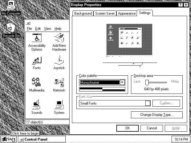
Windows 95 can be convinced to run in monochrome: http://toastytech.com/guis/miscw95bw.png (from http://toastytech.com/guis/misc2.html)
The people watching thought I was a magician.
(I also had several sealed original W95 boxes on floppies...(we shutdown an office, and as IT mgr - I had to go liquidate - and we had ~50 boxes of original release W95s there - so I took several home) and I held them for ~10+ years then sold them on eBay, I only got $25 for each - but I sold them as pieces of "computing history")
Windows 11 could also "fit on a set of floppies" - although thousands of floppies would be completely absurd, it is not impossible.
I want to say it was in the ~20 disk range...
There were a lot of really fun things that happened with W95 - a lot of "mischevious" cyberwar...
Like taking image of desktop as background came out with that - so nothing was clickable as a prank.
There were several backdoor utils
There were several prank links to something that seemed serious/work -- but then switched to a really loud voice yelling "IM WATCHING P*RN"
(The backdoor utils were really powerful though, and they remind me of a thing I am doing with Cursor/Claude -- Agent mode access to a fresh windows laptop as admin and having the bot fully config my new windows machine to my specs.
And I love your use of italics, Simon!