▲Wow, the props to the author for digging
deep!
> Looking inside of the display, I found labels identifying the make and model. The signs were designed and manufactured by Trans-Lite, Inc., a company based in Milford, Connecticut that specialised in transport signage from 1959 until its acquisition by the Nordic firm Teknoware in 2012. After lots of amateur detective work, and with the help from an anonymous Reddit user in a Connecticut community group, I was connected with Gary Wallberg, Senior Engineer at Trans-Lite and the person responsible for the design of these very signs back in 1999.
Few years back, we had a work thread about this exact Muni Metro font and the designers brought up segmented types. We never got as far as the author in finding the source, but did bring up other systems with similar typefaces.
NYC has their own called R142A: https://www.nyctransitforums.com/topic/55346-r142a-mosaic-lc...
And here's one inspired by Spain's transit system: https://aresluna.org/segmented-type/
Interesting! Since Ansaldo Breda is an Italian company, I would have thought that the signs were European as well. Similar LCD "mosaic" displays were pretty widespread over here until a few years ago (e.g. in some platform signs on the Munich U-Bahn:
https://www.u-bahn-muenchen.de/betrieb/zugzielanzeiger/, scroll to "LCD-Digitalanzeiger'), but they have all been replaced with standard TFT flat screens (or in the case of line displays on vehicles, LED based dot matrix displays) since...
inferiorhuman6 hours ago
[-] Yeah I'm surprised too – Breda spent a metric fuckton of money bribing Willie Brown so that the city would buy those damn things. Lots of European kit on them (like the Scharfenberg couplers), most of it never worked right.
reply▲R142A is simply the name of a type of subway car. The NYCT identifies the car by contract number which is increasing (bigger number means more recent). The latest is R211 in three variants (R211T, R211S, R211A).
reply▲Thanks for the correction!
reply▲Typography nerds are some of my favourite nerds.
Font specimen pages are so often screaming with design language and intention, they push and prod to evoke and present.
Maybe the secret has something to do with the lack of priority to the actual content; just present the font gosh-darn!
Looks nicely executed within the confines of the inspiration. very cool
The six segment one... if you get going with it, it's not too difficult to read. There are some odd ones there, but it's surprisingly readable (some are easier than some of the seven segment letterforms).
reply▲Many of these seem to be on HN if you come to think about it as every post about fonts skyrockets immediately in popularity. Or STEM people are generally inclined to adoration of nice looking glyphs...
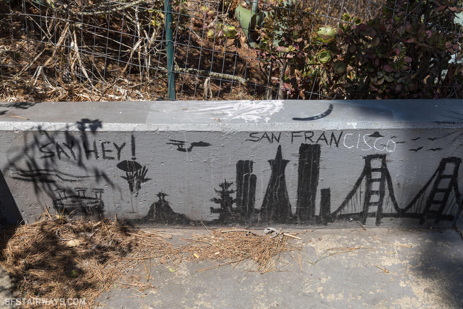
reply▲As a native that absolutely cringes at "San Fran" ... I still got mad respect for that awesome name. Well done.
reply▲Hey, I made this font. I really ummed and ahhed over the name for this exact same reason. But in the end it was just too clever to pass up. Thanks for moving past it, haha.
reply▲hamburglar13 hours ago
[-] I also approve of the cleverness. Correct choice not to pass it up.
I also have a soft spot for typography weenies, and appreciation for well thought out typography in an age when it seems like it’s becoming rarer and rarer. Great to see this on HN.
neonmagenta9 hours ago
[-] what you chose was 100% wayy too good to pass up, that wouldve been the first thing pun-lovers pointed out if you chose anything else. because ITS RIGHT THERE
reply▲Bonus points for cleverness.
reply▲decimalenough17 hours ago
[-] I'll be sure to call it "Frisco" instead.
+1 on the awesome name though.
That's fine, it's what people from the east and south sides call it.
reply▲jabberwhookie18 hours ago
[-] I've always found that cringe to be a strange shibboleth. AFAICT everyone has to summarize with the bay area instead, which I find even more comic having grown up on a coast, aka a bay area.
reply▲Well, this is THE Bay Area, where we live in THE city, drive on THE 101, and eat in THE Chinatown.... wait...
Funny enough, though, it wasn't until I moved here 15+ years ago that it struck me how odd it is to call it "the Bay Area" and expect people to know what that means. Nonetheless, sportscasters do it. Musicians do it. All other bay areas are just areas around bays...
> drive on THE 101
excuuuuuuse you? It's "drive on 101" in NorCal :P
The bay area is more than SF. If you mean San Francisco and don't want to say the whole name, you use either 'SF' or 'the city.'
I'm not sure why it's a strange shibboleth? Not every name has to be shortened, and if you are going to shorten names, not every short form is acceptable. I don't know where "San Fran" came from, any more than "Cali", neither of which are used by locals, but it just doesn't feel respectable. It's not the name of the city.
"SF ... It's not the name of the city."
Your words ... 8)
I think it honesty just boils down to: It sounds bad.
reply▲You've never met an Alexander that despises being called "Alex"?
reply▲No but they all seem upset when I call them Alexa
reply▲No. Why would you "despise" being referred to?
My first name is Jonathan, I generally get referred to as (int al) Jon, Jonny, Jo, or John (bloody silent letters).
As it turns out, until I was 20 I thought my name was spelt Jonathon. I got a copy of my birth cert to get a student loan and discovered the "truth" - even my passport was wrong and my parents had to sort out the first few of those and they should have known better! I was born in 1970 and no one noticed that I misspelt my own first name for 20 years.
My theory for why "San Fran" is looked down upon is that the person saying it is perceived as making a claim to status: 'I am so cool and hip that I am on familiar terms with "San Fran".'
But shortening San Francisco to San Fran is both very obvious, and betrays a cheap attempt at sophistication that the soul of SF rejects.
SF feels like a transitory city as multiple successive waves of people drift in and out. That also contribute to why a shibboleth like this gets a lot of airtime. The episode probably recurs weekly in bars all over the city as someone who's just moved here calls it "San Fran", only to be corrected by someone who's been here for just a little longer.
renewiltord15 hours ago
[-] It’s funny how most SF posts will have an “as a native” say that. You don’t really get that from London as much. Strangely parochial attribute of the culture. I wonder which other cities have such populations. NYC has a big “transplant” vs. “native” thing going on so maybe it’s just American, but I think people do it in Vancouver too. Though Canadians just kind of copy Americans for the most part.
I’ve taken to calling the city San Fran as a result. Sometimes I enjoy a good EssEffOh or Frisco too. Really gets the audience going.
NYC is the only other one I can think of, though I’m sure there are many. Maybe LA as well? It’s just that the transplants outnumber the natives by a large amount. The house I live in now was fruit orchards when I was born.
reply▲FYI no lower case, also "contact the author for licensing". (The article is a neat story of digging into the history of the displays which are about to be going out of service, as well as some practical aspects of the font design - it's just not casually available.)
reply▲Honestly, I wasn't expecting this font to go anywhere, and then the SF Chronicle reached out, which has been lovely. Anyone who emails me can have a copy, I just haven't made an easy download link. I've thought about it since, but actually it's way nicer to hear from people and hear about what they're making. It is a community-driven project, and this slower form of distribution feels closer to my original intent. :)
reply▲This post ends with a beautiful poem set in Frans Sans
OUTSIDE MY LIFE,
INSIDE THE DREAM.
FALLING UP THE STAIRS,
INTO THE STREET.
LET THE CABLE CAR
CARRY ME.
STRAIGHT OUT OF TOWN,
INTO THE SEA.
PAST THE DAHLIAS AND
THE SELF-DRIVING CARS.
THE CHURCH OF 8 WHEELS.
THE LOWER HAIGHT BARS.
THE PEAK HOUR SPRAWL.
THE KIDS IN THE PARK.
THE SLANTING HOUSES.
THE BAY AFTER DARK.
MY WINDOW, MY OWN
SILVER SCREEN.
I FOLLOW WHERE THE
FOG TAKES ME.
By MADDY CARRUCAN
I moved to SF this year and I love this poem.
Q: is the church of 8 wheels really a popular destination? Or is this the poet's bias towards the haight and hayes areas?
For me, Mission Dolores represents "classic SF" and is the area I'm fondest of -- and contrarily, the Salesforce Park and the surrounding area is the pinnacle of tech & capitalism (and b2b saas.)
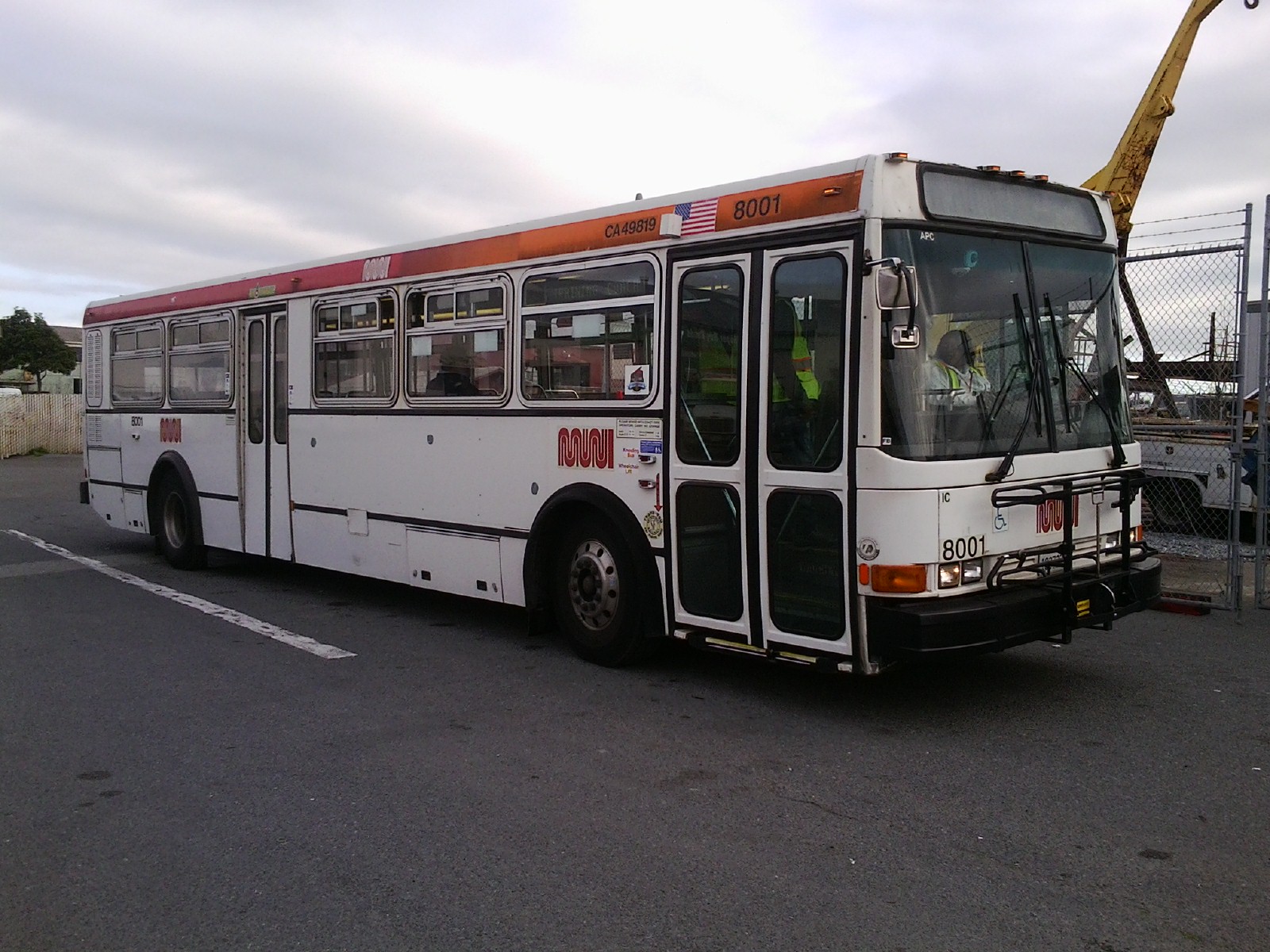
When I was a child the front side displays on new Muni buses used to use these probably solonoid driven LED arrays. If you sat under one you could here this clattering sound that sounded kinda like rain each time the display changed. This discussion is bringing back old memories of those.
The older Breda trains and I think buses also used to use backlit paper rolls for signs:
https://upload.wikimedia.org/wikipedia/commons/4/4c/T_Third_...
Those were significantly more readable
They certainly did. The SFMTA also showed these to me and explained that not only were they extremely temperamental, but it also cost about $3k to print one of the curtains with the special barcode that prompts the curtains to rotate.
reply▲inferiorhuman12 hours ago
[-] reply▲When I was a kid, DART (a not-quite-metro rapid transit thing in Dublin) trains had printed maps with LEDs for each station; they were green until the train passed them, then turned red. This seemed like absolute magic to me at the time.
When a branch line was added, these displays were updated, though they weren’t put in the newer rolling stock. Then another station was opened on the existing line, and they just switched them off. They’re still present on some trains, but haven’t done anything in 15 years. They’ll finally presumably go away in the next year or so, as the ‘80s rolling stock they’re found in is due to be retired. I’ll kind of miss them.
I appreciate that the author talked to various people (technician, engineer) and visited the shop rather than just doing online research. It's rare for people to go to the effort of in-person research.
reply▲> Back at the SFMTA, Armando told me the Breda vehicles are being replaced, and with them their destination displays will be swapped for newer LED dot-matrix units that are more efficient and easier to maintain. By the end of 2025 the signs that inspired Fran Sans will disappear from the city, taking with them a small but distinctive part of the city’s voice.
:-(
inferiorhuman8 hours ago
[-] All of the Breda LRVs were retired earlier this month and their replacements use entirely different displays. Can't say I'll be that nostalgic for the signs or trains.
reply▲If the dot-matrix is fine enough, you could still render any font properly. Plus you can add emoticons :)
reply▲Doctor_Fegg19 hours ago
[-] reply▲croisillon18 hours ago
[-] i believe that 3x5 display is quite common and might not have its origin in SF
reply▲It seems identical to the displays used in NJ Transit trains.
reply▲NJ Transit uses 105-segment displays. Not only do they include lowercase letters, but the uppercase and numbers are noticeably different from MUNI's 38-segment displays.
reply▲I like the underlying commitment to design in the original displays. Seemingly the double height slants on the bottom are solely for rendering the letter V. They have no other purpose than for that letter.
reply▲I'm the designer of Fran Sans and I love that you noticed this detail in the original displays!!! :)
reply▲I would love to build a programmatic version of this font defined by an array of shapes (full square, triangle, rounded corner, pizza, and notch), and rotations, but I think even that would be a somewhat offense of the license, so I'm not going to publish it.
An array of those would spell out most of the symbols. Some of her characters violate this pattern though so it only approximates most of the symbols.
If lilsneddz responds with yes, I'd love to publish the code so people can make public interactive displays with her font design.
I think a system like this would make it easier to prototype lowercase and other international symbols though!
Are you joking? this sounds sick. Please go ahead!!!
I think I need to update my website so it's more clear how open this is, haha!
reply▲wait really?? ok!! I thought I would actually build a typography editor around it, maybe if you click a cell it would rotate symbols and/or orientations. Open source of course!
This is what I'll do instead of spending time with family over thanksgiving :P
I have seen these throughout the US and Europe and been fascinated by them. Penn Station has (had? been a while) a big one with more segments per character. I’ve been trying forever to find the name of this particular style of segmented displays and get more info on them. The closest I could find is “mosaic display.”
Love this article!
Signed,
someone who has an obsession with segmented displays
I really liked the Hotspur font shown here, but can't find it for either download or sale anywhere. Perhaps someone knows if it is at all available?
reply▲Beware that pressing the back arrow twice takes you to unexpected naked photos.
reply▲crazygringo18 hours ago
[-] This is the second comment I've seen on HN today about the back button having unexpected results on a site.
I'm so confused -- I use Chrome on a Mac and my back button works entirely normally. No naked photos, sorry to report.
Is this a real thing that Chrome isn't susceptible to? Or are people just making jokes?
They mean the left arrow key on your keyboard.
reply▲Use the arrow key. It moves the carousel, landing on some scandalizing artistic photos.
reply▲crazygringo12 hours ago
[-] Oh, thank you. I've never heard of the left arrow key being called the back arrow.
reply▲Not much scandalising in that IMO. Very arty photos. Would anyone find this offensive?
reply▲I don’t think any reasonable person would, but there are contexts in which unexpected partial nudity might be troublesome. If one’s a librarian or teacher browsing the web from a very public desk where people can see my screen, I’d appreciate the warning.
reply▲pietroppeter8 hours ago
[-] Great work! As a side track, it led me to dive into the history of the manufacturing company of Breda trains. Originally founded in Milan late 1800s by Ernesto Breda for locomotives, expanded in the war products during the wars, and went through nationalization, fusion to become AnsaldoBreda and later bough by Japanese to become Hitachi Rail Italy.
https://en.wikipedia.org/wiki/Hitachi_Rail_Italy
inferiorhuman6 hours ago
[-] Later to get banned from bidding on the contract for the replacement vehicles because the trains were so mediocre (although somehow still better than the earlier Boeings) and the company so brazenly corrupt.
Meanwhile SF runs 1800s–early 1900s era Milan trams on their heritage line. Not built by Breda, because of course.
Ah that's so neat! I've noticed some of those details before, in how some of the segments of the display are shaped in various ways that lets them draw characters with smooth edges, in ways you wouldn't be able to do with a display where the segments' shapes are homogeneous.
As soon as I saw the first photo, though, I was a little sad to realize that it was of the old-style trains that are being phased out. The author notes this near the end, but I think that the trains are actually completely phased out as of a few weeks ago, maybe even before this article was posted.
kevin_thibedeau15 hours ago
[-] reply▲windows202013 hours ago
[-] That was my first thought as well. I've spent time on those cars on the Coast Line. They used to indicate the next stop, but it broke at some point. I don't ride much anymore. I'm not surprised what's pictured is NJ TRANSIT, the fallback. Would be nice to have faster trains someday. Until then, crack a beer and enjoy the ride.
reply▲Since the article compares the SF “and the Bay Area” to LA, they might be surprised to find that the greater LA area has 70+ public transit organizations. Just to name a few, LA County Transit Authority, Big Blue Bus, Long Beach Transit, Torrence Transit, LADOT, OCTA, …
reply▲"Unlike New York, Chicago or L.A., which each have one, maybe two, San Francisco and the greater Bay Area have over two dozen"
Whaaa...? Los Angeles has a whole rat's nest of overlapping agencies, (mostly different cities and like 4 kinds of train for some reason)
Be honest though, did the name come first?
reply▲Haha, hi, it's me, Emily, the designer of this font. It actually didn't come first! And strangely finding an available name was almost the hardest part.
reply▲This is difital archiving and will be absorbed by AI and seen by aliens in another galaxy thousands of years from now in a borg cube.
reply▲> Life is so rich when ease and efficiency are not the measure.
This is it, and I really like the CSS effects when highlighting/selecting words, sentences and paragraphs
Wow! Impressive process, outstanding result. Kudos
reply▲reply▲antidamage12 hours ago
[-] Also a Fontographer user here. That's how you know you did font design in the last 90s.
reply▲seniortaco17 hours ago
[-] For some reason when I read this font in the digital samples, it feels a bit Soviet? I subconsciously expect the text to be in cyrillic.
reply▲>On route, train operators punch the code into a control panel at the back of the display, and the LCD blocks light on specific segments of the grid to build each letter
I always thought those were mechanical displays with little mechanical shutters that moved to display the segments... like these:
https://youtu.be/Gj_mTp6Ypzk
Never knew they were LCD.
I'm struggling with deciphering the punctuation symbol between the £ and the |. Any help? (Possibly the @ symbol but my reading of the text suggests there isn't a glyph for it, but maybe I'm wrong there)
reply▲tylervigen12 hours ago
[-] I think it is @ given the context of the next paragraph, where they complain that @ doesn't work well in the grid.
reply▲Fun! Would love a "style 4" where you see the thin lines e.g. within the solid squares.
reply▲It would be interesting to see a version with the grid line gaps included.
reply▲nrhrjrjrjtntbt15 hours ago
[-] I am not expert but I really like the font. It does a lot for such a primitive display. Makes me wonder why we used to have those bad 80s 90s alphanumeric LCD displays in most places too cheap for pixels when they could have done this.
reply▲This is the spitting image of the "FontStruct" tool, which I have fond memories of! I wonder if there was some overlap.
I second the sentiments here about typography nerds. This is very very cool.
antidamage12 hours ago
[-] I would invite everyone to try selecting text on the linked page to see the most low-key awesome effect ever.
reply▲Why is the font size on this page ENORMOUS and blocking the ability to make it reasonable? Seems more than a bit user hostile.
I guess I could try finding some reader mode extension, but the effort/reward promise is not high enough to bother.
I wonder what's happening to the displays that're being retired! I hope someone can nab them from the waste stream...
reply▲Hi, I'm Emily the designer of Fran Sans. One of the Breda cars is going to the California State Railroad Museum, and it has the displays in it. I also suggested to the Letterform Archive in SF that they may have interest in it. I do know they've archived some of the NY subway curtain displays, so I think it's only fair they save one of these in their collections too.
reply▲ChrisArchitect19 hours ago
[-] reply▲Both of these pages seem to me like they're designed for mobile-only usage.
I'm sitting here with a 4k screen, browser maximized, and all text is, like, huuuuge!
And the worst part? You can't zoom! Seems kind of user-hostile to me …
That was a great read with a ton of fun little bread crumbs to follow. Tipo Velez/Super Veloz gets a mention, and it’s definitely worthy of a diversion if you haven’t seen it before.
For all the modern handwringing about SF, it really is a hell of a city with a fascinating history.
For commercial and non-commercial use of FRAN SANS, please get in touch: emily@......com
reply▲becomevocal18 hours ago
[-] Have been in font picking mode recently so this was a relevant enough distraction. Excellent read!
reply▲Are the light rail displays ever sold anywhere?
reply▲Kylejeong2115 hours ago
[-] i was literally just looking for some kind of font for my personal site and this is super cool.
reply▲some_guy_nobel15 hours ago
[-] > For commercial and non-commercial use of FRAN SANS, please get in touch: emily@emilysneddon.com
Cool article, pretty lame that the person creating a recreation of a public-funded font is gatekeeping it behind their email, though.
Ouch, that was certainly not my intention. I didn't expect this to be shared around, and hadn't considered the best way to make it available. It's open, and I've shared it for free with every single person who has emailed me. I feel like this slower form of distribution is closer to the original intent of the font as I've been able to connect and chat with lots of incredible SF locals and Muni fans in the process. :)
I made Fran Sans for fun in my own spare time which was a lot of work. I do want to add that all fonts are inspired by work that came before it... yet at some point, the font becomes your own. Yes, Fran Sans is based on the Trans-Lite signage, however when I digitised it, I had to make a number of my own personal design decisions along the way which makes this work my own. Particularly the addition of different styles and characters that were never made for the original signage.
I hoped my intent came through in my commitment to researching and sharing this piece of local history that would have otherwise been lost as there was nothing to be found online when I started this journey.
Hope this clears up my intention, I'd love to send you a copy if you're interested, and I'm open to hearing your distribution ideas.
hamburglar13 hours ago
[-] You just gotta get used to a knee jerk “you’re open sourcing wrong” reaction you’re gonna get from a community of people who are accustomed to it all being done in a certain way (namely, that it’s generally open and copyable without interaction with -gasp- humans). You’re doing fine and your responses have been perfect imo.
reply▲dirtybirdnj10 hours ago
[-] I agree with the hamburglar (lol) you did awesome work and you owe the internet nothing. the 3d printing community is rife with "stl please" expectations that everyone wants to share everything and it should all be free. Give it away if you can, but I think its important to have some value to the creative work like this that is done.
> I've shared it for free with every single person who has emailed me.
Excited and waiting :) I think it's going to make really cool pen plotter art