And then just above is a bunch more ovals and circles. The sidebar button is an oval, the back/forward buttons are in an oval, the Wipr extension icon is in an oval, the URL bar is an oblong over, etc. And (at least in light mode) this is all white ovals on a white background. It all looks so amateurish.
I'm so glad that Hack Alan Dye is gone and I pray to God that Stephen Lamay can get us back to reason. I doubt they'll do an overnight Cmd+Z update in macOS 28 or whatever, but perhaps he can direct Liquid Glass in a direction that isn't just rounding things for the sake of it.
Liquid Glass does have some good points, but it feels like someone turned in C- level work.
It had a glassy aesthetic but the similarity doesn't go much further than that description. They didn't make all the buttons into glass blobs floating on top of the content with distracting warping effects; the window chrome was still generally separated from the content.
Let liquid glass be your red pill - come join us in the real.
The cross platform scene is much different these days. Electron apps suck, but at least they suck equally across all platforms. And there are many Electron apps.
But a lot of people rely on Adobe, Microsoft or Windows-only, Mac-only apps. I don’t see that changing anytime soon, unfortunately.
AI is making handling the edge cases that kept people locked in almost trivial. Any workflow, custom spreadsheet, specific OS-only app can be worked around, easily. Staying stuck on Apple or Microsoft is a choice - they're no longer returning value concurrent with the money they charge.
You're free to continue giving them money, but the reasons to do so make less and less sense each day that goes by.
Inkscape is not an option, nor is anything involving importing PDF/SVG, those have to expand a huge ton of stuff that's represented much more compactly in an .AI file. It's about as large a difference as that between an executable file and its source code.
https://techdocs.broadcom.com/us/en/vmware-cis/desktop-hyper...
It seems like they removed it from VMware 17.6, but maybe another VMM still has this functionality?
Inkscape, Affinity, other open source alternatives exist, but have a remarkably different UI and don't capitalize on your muscle memory.
The feature overlap is bordering on complete, but there are some Adobe Illustrator only perks, for sure. Most of it you can make up for with any of the frontier image AI models.
There are plugins - if you're well versed in how they work, converting between AI and vectorpea should also be a piece of cake with AI.
There are plugins - if you're well versed in how they work, converting between AI and vectorpea should also be a piece of cake with AI.
I'm an artist, not a prompt jockey. My interest in spending even a minute of my life trying to convince a plagarism engine to spit out something half as refined as Astute's plugins for Illustrator is absolutely zero.
What's the AI workaround for Illustrator/After Effects/etc.? You're not suggesting generating vector art or video assets via LLM replaces these, surely?
There’s nothing that comes even close to Photoshop. Same for a lot of similar professional tools.
> AI is making handling the edge cases that kept people locked in almost trivial
Not for anything remotely complex. Let’s see how that looks in 5 years, but I’m skeptical.
I've converted over a dozen weird edge cases of spreadsheets and access apps and ancient scripts used by departments into standalone little apps or browser apps, ranging from budget and finance related bookkeeping to tracking sales to licensing management. The only advantage Excel has over this is ease of maintenance - it's a lot easier for someone to guide themselves through updating things on a spreadsheet, or to break an idea down into multiple pages, etc, if spreadsheets are what they're familiar with.
If you're an engineering or finance firm dependent on an obscure, unique Excel feature, I could at least see the argument that your use case is too hard to migrate off of Windows.
> exceeds CS6
I wish. It's not even on par with Photoshop 4. No LAB mode, handles only 4 profiles. I could be here all day listing missing features. Also, have you tried to open a 6GB PSB file with it?
I've used Photoshop almost daily since 1994. I really wish there was an open source competitor. There isn't.
I'd rather Linux developed an identity of its own. I feel like keyboard driven tiled windows are the closest it has to that.
They just need to get back into the mindset that design is how it works. Not forcing some aesthetic into everything with the superficial idea of "focusing on content" as a backwards justification for making everything transparent cause someone thought it was prettier.
Linux is for people who want to get rid of "they". If "they" start screwing things up, you switch to a different "they". Alternatively, you become "they" by forking the project.
This doesn't make sense for the vast majority of people.
Linux desktop doesn't have the vast majority of the niceties that living in the Apple ecosystem gives you. If I was going to rebuild any one of them for Linux, it would easily become a major project that would suck up all my free time.
That's fine.
> Linux desktop doesn't have the vast majority of the niceties that living in the Apple ecosystem gives you.
And it never will should nobody actually step up and put in the work to make it a reality. Linux needs users willing to do such things.
The original free software business model is that people would pay programmers to work on the features they needed and the results would go back into the commons in the form of upstream patches. I've actually made some money this way. It was nice.
Do most people want to get through that research? Absolutely no, I don't expect many people to follow me into that rabbit hole. They can get the default or Windows or a Mac, no problem with that.
Claude did tell me where to fiddle with CSS, but its suggestions where not always on spot. It cut the time I spent on it and maybe it made it possible, because I wouldn't have dissected the source code or inspected the UI in the right way (GTK inspector). All the process still cost me a few weeks of five minute attempts now and then.
I think that there is no way an agent (and I was using the chat UI) can take control of my desktop, patch CSS, restart it, take advice and give me what I want. Not yet.
By the way, I have an autohiding Windows 95 like app bar at the bottom. The text inside the app items is still a bit too small and some icons in the terminal top bar are still too narrow. I think I have more CSS to fix but I'm in no hurry.
Claude Cowork can do such things if you set it all up.
Nothing inherently prevents Linux from replicating those features. It's just that somebody's gotta put the work in to make it happen. That somebody could very well be you if nobody else cared to do it.
My laptop has fancy RGB keyboard LEDs. Manufacturer shipped a shitty Windows app to control them, as well as the internal fans. My choices were: either give up on those features or implement them myself. So I reverse engineered what I could and made a Linux program to control the LEDs. Threw it out there on GitHub just because and woke up one day to discover that not only did I have users but somebody else had independently built a GUI on top of it.
The idea is not to change Linux distributions into Apple tier experiences. The idea is to convert you into a contributing user who is capable of solving his own problems and making his own features. The idea is to elevate users from consumers to contributors who take ownership of their systems.
That's the only way you can ever be free of "they" and whatever "they" decide to impose on you. Being at their mercy is a dangerous position to be in. Forcing low contrast glass UI on users is a nonissue compared to that one time where they threatened to start automatically scanning everyone's devices for CSAM. There's really no limit to what they can do to you should you relinquish ownership of your machine to "they". That's what I want people to understand.
Until you want to contribute but is stonewalled and gatekept by overzealous devs to the point that you lose all interest in contributing and just give up. Which means you are back to using a “they” computer—not a big corp “they”, but a “devs somewhere” “they”. Pretty much exchanging six for half a dozen.
Still preferable to being completely at someone else's mercy though. It is always better to have the option to maintain a fork if needed. I actually maintained my own custom fork of bash for quite some time. About a year later upstream added the feature I wanted so the fork was no longer necessary. It was a pretty good exercise though. Maintaining the fork turned out to not be that hard. All I had to do was pull upstream, rebase my branch on top of upstream, recompile and repackage. It is always better to have the power to do this than to not have it.
The absolute VAST majority of Linux users are not out there forking their own distros or creating their own WMs. They, more often than not, are just fine with using whatever is being cooked up by the big names in the Linux space, people aren’t giving up the “they” just because the “they” is now KDE or GNOME.
Hell, even Torvalds himself has gone on record to say that he just wants his computer to work and is happy using Fedora and GNOME (the very definition of a “they” Linux).
I built a freestanding lisp interpreter that runs directly on top of the Linux kernel just to prove this. Zero dependencies, native system call support. I know that everyone is going to want stuff like glibc instead. But it was possible, so I did it.
For those that such options do matter, it is absolutely essential (I’m in this category). But for the common user, it’s just another thing that their system does that they don’t understand and have no desire to spend time learning. Most think like Torvalds himself: they just want a computer that works and gets out of their way.
I'm arguing against the "common user" migrating to Linux though. "Linux is for people who..." I just didn't want to say it out loud. If this stuff doesn't matter to you, then obviously you shouldn't use it. I'm just trying to convince others that it does matter.
I want Linux to be the programmer's system, and I want a world with more programmers in it. I have no interest in "common users" other than the fact they might one day become programmers themselves.
I think Liquid Glass looks good.
What's a good calendar app on Linux?
What's a good e-mail client?
What's a good photo and image editor?
I love Liquid Glass - the blur and refractive effects are so pretty and technically impressive - but it should be used tastefully instead of this nonsense. I feel like Tahoe in general is straying way, way too far from the battle-tested Cocoa foundation and into this total top-down crap. Liquid Glass feels like some sort of shareholder-enforced enshittification.
macOS is supposed to be defined from the bottom up; it always has been. There has always been importance in having a solid base; a robust foundation for developers to build on. HIG, Cocoa, CoreGraphics, all of that is in service of this. The user experience and vertical integration is a result of this and couldn't exist without it.
There's so much wrong with Tahoe that goes against everything Mac has ever been. We don't want to dumb down the interface; that has never been the goal. The goal has always been to make the interface intuitive enough that anyone can learn it. macOS and iOS are fundamentally different platforms with fundamentally different design constraints and considerations.
Icons being able to escape the squircle was supposed to be a reflection of the fact that apps on Mac are less contained than apps on iOS. They have more expressive power and more advanced capabilities. You're working closer to the metal and in a less controlled environment. Because of that, you can do more and you're not constrained to the flows of the system.
iOS always hasn't been this. The constraints of touch are different than the constraints of the desktop. Steve Jobs spoke about this a lot back in his day, about why iOS is so much more locked-down than Mac.
But Mac has always been a platform for freedom and control. And Tahoe strips the soul of that.
My impress has always been the opposite: MacOS is "opinionated", and the user can either accept the Apple way of doing UI or can take a hike.
MacOS has offered token customization, such as allowing the user to change the color of menu bar highlights, but any substantive change required 3rd party intervention, which would inevitably cease to function at the next upgrade.
These days the OS is even more locked down, making it all but impossible to modify OS files.
I don’t like it either, but I wonder if that’s to support the touch-enabled Macs that the rumor mill is reporting about right now.
In any case, Tahoe has many other issues beyond padding.
Perfectly proving my point. It's a meaningless argument built on vibes that every reader interprets differently.
However, jargon words are just jargon words. There really are only two options:
1. Police them ruthlessly. Even if the word would only cause confusion in the amateur / casual observer, they must be eliminated anyway. I venture that this means almost all jargon words must be turned into words totally devoid of meaning. Jargon is useful - nobody wants to spend the same 3 paragraphs to convey a complex but very common concept - they invent a word for it. So, are we ready for the 'floobargle' and the 'glorpnitz'?
2. Just let them be, and instead police the idea that words that are jargon imply anything at all. Police the idea that their plain english dictionary definition holds any relevance beyond being a memento for what the jargon word is truly meant to convey.
In other words: The problem lies with those who realise 'chrome' is a jargon term and then kneejerk into '... it is frippery' anyway. That's stupid. Those who do that should be ridiculed.
I think that's the only way partly because that feels right and because I think it would lead to eliminated of jargon (bad endresult) or always ending up with jargon that is just a random word that has no meaning at all and wasn't in any dictionary.
No, it's the only feasible way, because of pragmatic reasons: Changing existing jargon? Hoo boy. That is extremely difficult.
As an exec sitting there frustrated by the slow pace of software development, at least you can always yell at the UI guy and demand changes that your gut tells you "look cool", and you can be an active, though uninformed particpant in sessions with design mockups.
Car UIs are a great case in point. People have been yelling for years at the poor usability of touchscreens in cars as opposed to discrete buttons/controls. Yet the enshittification of car UIs continues unchecked. My ioniq 5 has multiple touch panels and buttons, yet something as simple as directing air flow to the dash vents requires me to prod at a tiny touch area and look at a separate tiny display area well away from the touch control to see what I managed to select. It is 10 times worse than an old school rotary dial that I could operate instantly by touch alone. My workaround now is to prod the control, wait for 5 seconds to see if I feel air start flowing, and if not, prod the control and wait again.
Peak usability of most computer UIs was back in the 90s when simple (to use) but deep and powerful hierarchical menus were uniformly placed at the top of the page, and right clicking on objects in the UI opened context-sensitive popup hierarchical menus.
For cars it was in the 2000s before touch screens.
I'm hoping whatever model I replace it with will have physical controls too.
They blur together. I can't see which is document and which is chrome. This is the article's point, but... how can Apple be saying what they have, when I feel that since Big Sur at least it's not only perceptively but arguably objectively not true?
But we're making the UI gEt OuT oF tHe WaY .
One of so many reasons why I love mpv so much. Fine control via keyboard, allows turning off all the UI elements. Always a pleasure to use. I hate having to use any other media player.
NNGroup has written about this trend: https://www.nngroup.com/articles/content-chrome-ratio/
Liquid Glass also makes more sense on tablets. I think Apple is copying Microsoft because Apple is also moving toward full UI-level unification between their desktop mouse-and-keyboard UI and their mobile/tablet touchscreen UI. They've already done it for some apps (e.g. Notes.)
[1] https://www.macrumors.com/2026/03/08/apple-planning-macbook-...
Apple copying Microsoft is a mistake. It used to be the other way around.
I actually really did like Windows Phones though. I can imagine a world with a third competitor in that space today... But MS didn't seem to have any understanding or ability to develop an ecosystem that works. Even when they were literally paying people to write apps for their app store, it was just terrible.
Remember also the "Get a Mac" ads that parodied Windows Vista permission dialogs, but now macOS is a permission dialog hell.
Tim Cook was an IBMer. I'm sure that Cook was a fine hire as an operations manager, but I doubt that Steve Jobs intended for someone like Cook to be in charge of everything at Apple, including UI design. (Jobs never put Jony Ive in charge of software, by the way, whereas Cook did.) Indeed, I doubt that Jobs groomed anyone to be his successor. By the time Jobs learned he had a fatal illness, it was too late, and he had to turn over the company to someone the board of directors would accept, which was Cook. Jobs was CEO but didn't own the company; infamously, the Apple board of directors chose John Sculley over Jobs in an earlier power struggle.
When Cook took over, he was unequivocally the only choice. He steered the company in his own direction, with a focus on operational health to the detriment of other things. He kind of lost the plot somewhere in there and has been spinning his wheels for a while. That's not what I'm contesting. It's your idea that Jobs didn't want Cook. Jobs loved Cook.
Any time Jobs had to step aside from the CEO position temporarily, Cook took over immediately. Metaphorically speaking, Cook kept the trains running on time. Cook did not set or change the direction of the company at the time, and Jobs was still available for consultation.
Sick is not the same as dying. Jobs initially didn't think he was dying, and tried to treat his illness with some hippie-dippie "alternative" medicine, when aggressive treatment might have saved his life.
> He was Jobs' designated successor for a decade when he learned he was sick.
Citation needed.
> Jobs loved Cook.
In what way? According to biographer Walter Isaacson, Jobs lamented that Cook was "not a product person".
What puzzles me is that information like this is out there. How did Apple get it so wrong?
I am hopeful for the new UX VP. He has his work cut out for him.
In subsequent examples the controls have made less space for content and obscured it. And takes up space with less-often used things like line spacing and and drop caps. Feels like I'm being told that up is down.
And the smudgy liquid glass effect just makes everything look grubby. Not classy.
I really REALLY love the Lion icons. Colorful but subdued with only mild saturation, distinctive shapes, strong line borders with very slight halo, and mild gradients to make them pop.
I need contrast in order to differentiate content. I need contrast on buttons to know where to click and what is clickable. I don’t need to depend on muscle memory. On Catalina it was automatic. Chrome in moderation is not bad.
Homebrew doesn't support any macOS version that isn't supported by Apple either.
This is pushing AI down my throat (+ privacy, but IMO Apple is at least okay-ish in this regard) is my main reason why my next laptop will not run macOS. Maybe Asahi Linux will finally support Thunderbolt, but maybe I'll just switch to a Framework. I'm just happy that I stayed on 15.7.5 until now. As soon as this gets no updates anymore, I'm gone.
From a commercial point of view branding and how it looks is more important. People buy what looks simple - they are not going to spend time trying something out to asses what is simple.
I do wonder if we'll see the pendulum swing the other direction. We used to have UX designers that actually studied users and how best to mold the interface to them. I think now is the best time ever to get into UX design and make your mark by showing the world that software doesn't _have_ to be flat, lifeless, and radiused to hell and back in order to be great.
Yeah but why? Is it just a design trend? Is it just fashion? Or is there some underlying reason why it went this way?
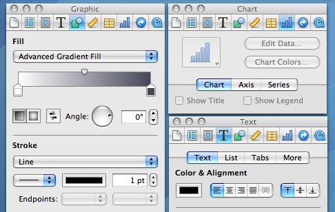
The formatting bar was an (IMO unnecessary) option added in iWork 08.
With iWork 2016, they took the existing inspector panel setup and docked it into each window.
Pretty sad state of affairs. Software isn’t build for usability but purely for whatever designers find fashionable at the time.
Then any OS upgrade would simply be an extra theme suggested by the OS that I can safely ignore and continue to use my own without breaking my workflow?
Now the visibility of the liquid glass stuff, that is definitely a problem. Can't recognize a UI element if it's constantly rendered differently and with very little contrast with the background elements.
Well, I guess someone is going to vibecode a decent Linux GUI or fix the driver pains there or something and we'll be free of this. Because Microsoft/Apple and to a lesser extent Google have jumped the shark with their UI these days.
The sidebar for formatting they added is strictly worse than the inspector UI in old Pages ’09. The sidebar is constrained not to overlap with content, but the user can choose to overlap the inspector. It’s strictly better flexibility for users. If you are doing a lot of fine adjustments to a single text box, then of course it’s fewer mouse movement if the inspector is located right next to the text box, despite that it has obscured other irrelevant text boxes. I dearly miss Pages ’09.
No one forces you to, you can learn it only once for the toolbar as it's 1 click instead of many clicks for menu navigation. Just like when you use shortcuts you don't need to remember where the command is in the menu?
I can guarantee you they have done no such research. This redesign is a clear top-down imposition to make the visual language uniform and match some lead designer’s specs, not to actually make anything more useful or usable.
In the example, we have a sidebar for the formatting in the newer example vs havign that in the toolbar in Lion. Was it that back then, people were more likely to configure fonts & formatting settings, and we've gradually as a society de-emphasized our formatting in word processing? Or did UI changes such as this, hiding formatting options push us towards a world where we care less about formatting? I'd like to think it's a bit of both; as the user-based broadened, you had less percentage-based people that cared so heavily about formatting, so UI changes were made to optimize for that, further pushing people in that direction.
On a different note, I want to call out just how badly the sidebar is laid out compared to the toolbar. In the Lion toolbar, there were unlabeled sections but it was pretty clear what the purpose of each group was. Then you have the sidebar, where labels are added in some places, excessive space given where uneccesary, tabs that are sectioned off from the settings they'll show/hide, collapsible sections that can also be shown/hidden, some dropdowns using up/down caret while others just use the down caret, most dropdown carets being right-aligned but not the gear one, and in the liquid glass versions, the overlay of toolbar buttons over the sidebar creating confusion.
Arguing aesthetics is pretty pointless (it’s a decided question to me: my taste is great; most others have very poor taste).
What bothers me about Tahoe are all the sloppy bits, like things you can no longer click or scroll to. We’re on 26.3.1 now and it looks/works like 1.0.
What really matters is not how the screenshots look, but how easy it is to use the software in action, with low error rate and without having to spend more than a fraction of a second finding the controls you need.
Anyway, we know people read symbols by shape/lines/pattern just fine without color because that's how reading works.
> What really matters is not how the screenshots look, but how easy it is to use the software in action, with low error rate and without having to spend more than a fraction of a second finding the controls you need.
Indeed. Which is why this article is mostly blowing wind.
Here, for example, the colors we're discussing are the toolbar icons in the screen shots. A lot of the colors are arbitrary, so don't really impart information. E.g, shapes are characteristically green, tables aren't characteristically yellow, charts aren't characteristically blue. So that's noise, not information. You can only hope that doesn't degrade the UI too much. The yellow sticky note, on the other hand, is characteristic, so does impart information, and the color wheel is perfect. So some good ones and some bad ones. Not clear at all it's good. Now, people who use the software a lot will come to learn arbitrary associations, but, of course, that goes for any arbitrary association.
The color may not carry any information content by itself, but it still helps distinguish between icons that use different colors.
I'm still on macOS Sonoma 14 and iOS 18