1-Bit Hokusai's "The Great Wave" (2023)
329 points
3 days ago
| 20 comments
| hypertalking.com
| HN
francoi8
1 minute ago
[-]
For those wanting to explore automatically converting art pieces to 1-bit you can use 8Bit Photo Lab on iOS or Android. Select the black and white palette and choose resolution and dithering type.

Play Store: https://play.google.com/store/apps/details?id=com.ilixa.ebp&...

App Store: https://apps.apple.com/us/app/8bit-photo-lab/id6759910005

reply
noisy_boy
1 hour ago
[-]
Hokusai's work is amazing prima facie. But then when you download the archive.org pdf files (see links in comment from @abetusk) and start to zoom in, the mastery of the strokes just blows your mind. The skill is ridiculous. The stylization, the capturing of the essence of a bird turning its neck by basically the minimum possible strokes while maintaining the feel of dynamism and suspended motion, it is just too much. Nothing makes me more emotional and romantically sentimental of beautiful japan from an era, which in my logical head, I know had lots of hardships and difficult life. He still manages to put that aside by the sheer power of the infusion of tranquillity in his paintings. It makes me long for a time and place which I would never see and probably was a lot harsher than I can see through the mind of his brushstrokes.

Hokusai has long been my favourite artist but I still keep finding more nuances in his work. He lived an 88-year long life dedicated to art. What an unbelievable genius master of a bygone era.

reply
KaiserPro
4 hours ago
[-]
I really like the layout and style of the site. I never had a mac growing up so its not a nostalgia thing, I just appreciate the compactness with contrast

The art is also very good. Its hard to get that level of "colour" with limited resolution

reply
walrus01
2 hours ago
[-]
The portrait mode black and white layout of this is similar to the high resolution black and white displays which were in use with some more expensive Mac based "desktop publishing" setups in the late 1980s and early 1990s.

This was before anyone could reasonably afford a 20" full color monitor, and it also would have been too expensive or I/O intensive on the video expansion card to be capable of driving a 1280x1024+ monitor at 256 colors or better. I think also something related to being a crisper image with early 1990s tech level of CRT monitor re: dot pitch if the image was entirely black and white?

For instance:

https://www.reddit.com/r/retrocomputing/comments/1oim0m6/hol...

https://www.reddit.com/r/retrobattlestations/comments/707q70...

reply
etothet
2 hours ago
[-]
I love this. In a world that is increasingly driven by AI, to me this highlights how important and mandatory human creation is in art.
reply
msephton
34 minutes ago
[-]
Impressions of The Great Wave Off Kanagawa 神奈川沖浪裏 are currently on view at a record 7 places around the world. https://greatwavetoday.com

Each one of the remaining originals is subtly different due to the woodblock printing process, and must be stored for the majority of the time due to being susceptible to fading in light.

reply
srean
39 minutes ago
[-]
I have been moaning about this n the comments below about not being able to find Hokusai's study on tesselations and patterns. Finally found it.

https://dl.ndl.go.jp/pid/1899550/1/11/

Have submitted as a post

https://news.ycombinator.com/item?id=47902993

reply
convenwis
1 hour ago
[-]
I know this guy is doing this on actual Mac hardware but curious if there is a point of view on the best older Mac emulator out there? Ideally I'd like to run this on a current Apple Silicon Mac. It is hard to understand what is the best approach (which I realize might be because this is somewhere between legally grey and not legal). I don't want a browser based option.
reply
spicyjpeg
53 minutes ago
[-]
I would recommend trying out Snow (https://snowemu.com/), a somewhat recently released 68000 Macintosh emulator that is cross-platform and focuses on low-level accuracy, unlike prior efforts which traditionally preferred HLE approaches and suffered from compatibility issues as a result.

As with any other emulator, you will have to obtain system ROM dumps and disk images of the software you want to run. There is no clear precedent on the legality of acquiring said files through any means, however it's generally believed that you should be in the clear if you dump them yourself from a Mac you own and an original physical copy of the software. Of course, doing so is non-trivial and requires at the very least a working Mac and a way to get files in and out of it (e.g. a SCSI drive emulator that uses an SD card for storage), so it's understandable why virtually everyone resorts to the gray area approach of downloading ROMs instead.

reply
quag
47 minutes ago
[-]
I’ve spent many hours using Basilisk II.
reply
jervant
1 hour ago
[-]
Snow
reply
srean
3 hours ago
[-]
I am having a surprisingly hard time finding Hokusai's exercises on tesselations.

Has search become really this bad !

Anyway wanted to show his sketch of a bird behind chicken wire fence/cage. Similar birds here

https://news.ycombinator.com/item?id=47901702

reply
kevin_thibedeau
2 hours ago
[-]
reply
srean
1 hour ago
[-]
Oh nice. I had not seen this before but it fits the description very well -- birds and tiling patterns.

The art work that I had in my had a swallow or a sparrow swooping down, looked at through chicken wire grid.

reply
abetusk
2 hours ago
[-]
reply
srean
1 hour ago
[-]
Thanks for the links. There are one or two in common with what I had in mind. I suppose those weren't his 'published' works but personal studies in geometry and tiling.
reply
saadn92
1 hour ago
[-]
This is what keeps me coming back to HN. Someone spent years recreating woodcut prints pixel by pixel on a quadra 700 using aldus superpaint at 512x342. I feel like the constraint is what caused it to be. The 1-bit forces you to solve every gradient and texture with pure composition, which means you can't cheat with color or resolution. I forgot who said it, but constraints breed creativity.
reply
usrnm
5 hours ago
[-]
It's insane, how far our industry has come in less than a single human lifetime. I wish I could see what will become of it in a few centuries.
reply
walrus01
1 hour ago
[-]
It's also kind of insane how rapid the capabilities and tech grew in just a short 10-year span in an earlier period. The B&W mid 80s Mac art style of this reminded me of approximately the same era...

For example right now if you had a $3000 desktop PC (sans cost of monitor) that was built in 2016 it would probably still be a fairly capable Linux workstation.

If you went from 1986 --> 1996 the tech jump in equivalent cost would be something like a 12 MHz 286 with EGA video card, a few MB of RAM, a MS-DOS CLI environment to in 1996 being a Pentium 66 MHz+ or AMD equivalent with significantly more RAM, a SVGA video card, tons more I/O, PCI slots, running Windows 95 or an early Linux distro, and just a whole world more capability. The 286 would be quite obsolete and barely useful for anything.

reply
TacticalCoder
1 hour ago
[-]
> ... or example right now if you had a $3000 desktop PC (sans cost of monitor) that was built in 2016 it would probably still be a fairly capable Linux workstation.

Oh totally. I've got an actual workstation, with ECC mem, from 2015 and a Xeon with 14 cores / 28 threads (tbh I think that CPU alone was worth more than $2 K back then) and it's still plenty quick. I use that old workstation a server though and my "workstation" is a much more modern AMD 7700X (not the latest or quickest CPU by any mean but it's already quite beasty).

reply
usermac
2 hours ago
[-]
Having seen this image since inception, I never noticed Mt. Fuji in the background.
reply
dvh
2 hours ago
[-]
I didn't notice the boats
reply
vharuck
41 minutes ago
[-]
A lot of Ukiyo-e wood prints have small details that mean a lot to locals. I enjoy learning about them on the NHK's English channel.

In this case, the boats are fast (each has a bunch of crewmen) and were used to catch valuable fish. And the boats on the right have two people not at work (barely discernable in TFA's recreation). Those people were on break, getting ready to replace tired oarsmen. That way, the boat could be moving at all times.

reply
IncreasePosts
2 hours ago
[-]
Its gotta be in there - that print (and 35 others believe it or not) are from hokusai's collection: Thirty-six Views of Mount Fuji
reply
greg_dc
1 hour ago
[-]
Man, this is the sort of stuff that makes me glad for Hacker News. Someone doing a hyper niche, high effort artistic project for no reward other than it's something they want to do. In a time where I have to second guess absolutely everything in case it's just AI slop there's something so wonderfully human about this sort of endeavour.

I would never have known it existed and, in some tiny way, my life is better now that I do.

reply
SomeHacker44
3 hours ago
[-]
Curious about the "no derivatives" license. Surely anything derivative would be of the original now public domain art and not this. I do not see how this could as a practical matter be enforced. IANAL though.
reply
teraflop
3 hours ago
[-]
Public domain isn't "viral" like copyleft.

If I take something in the public domain and make a derivative work, the original remains in the public domain, and I retain ownership of whatever additions or modifications I created. So I can attach whatever conditions I want to the copying of those additions.

For instance, Disney's "Sleeping Beauty" was protected by copyright when it was released, even though it was based on a centuries-old fairy tale that was in the public domain.

reply
jszymborski
3 hours ago
[-]
Well not if I take this 1 bit image and add my logo or remove his...
reply
cubefox
3 hours ago
[-]
More 1-bit pixel art:

> MacPaint Art From The Mid-80s Still Looks Great Today - https://blog.decryption.net.au/posts/macpaint.html

Previously discussed here: https://news.ycombinator.com/item?id=44540402

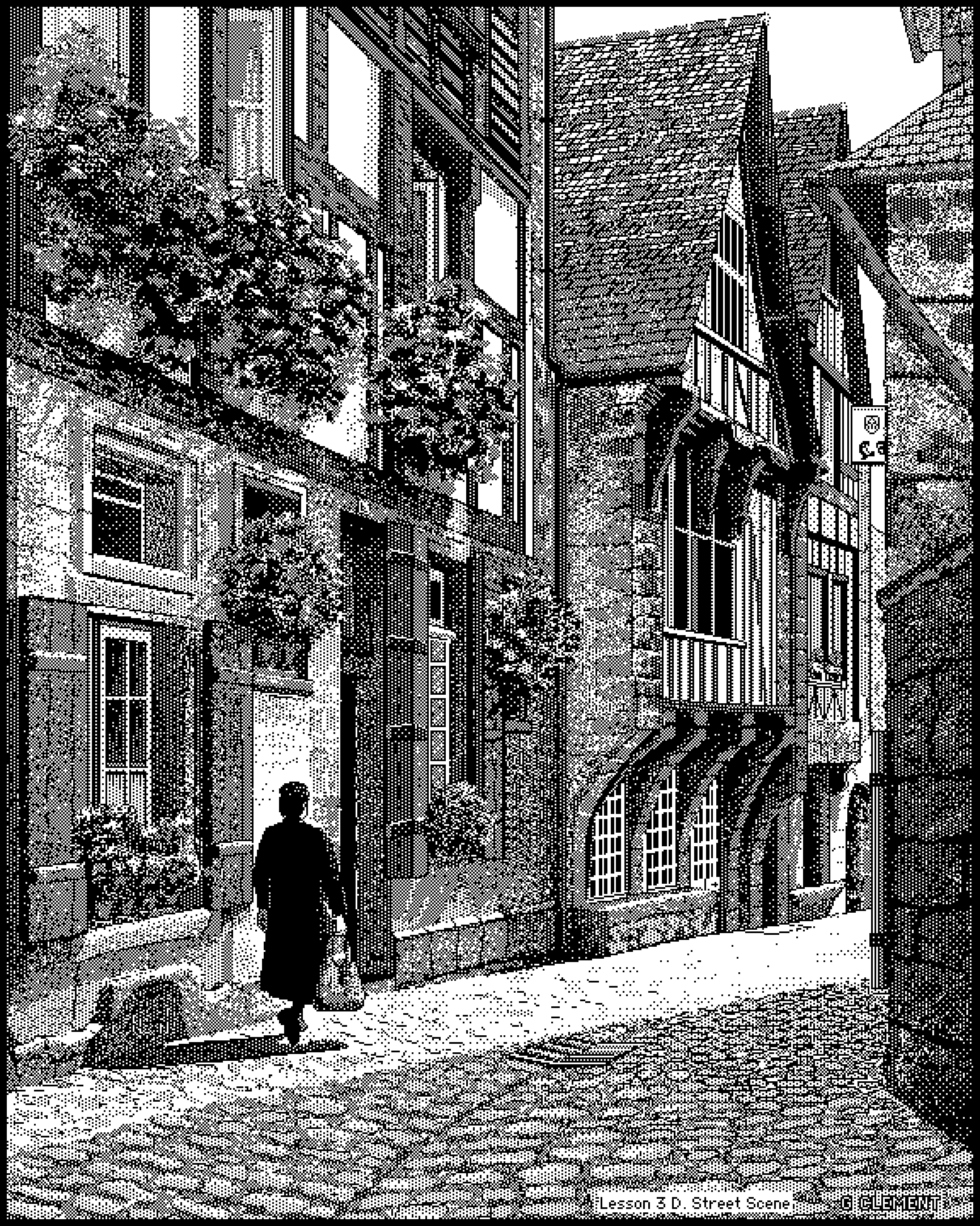
This masterpiece by an unknown artist might be the best work of hi-res pixel art I have ever seen: https://blog.decryption.net.au/images/macpaint/lesson3d.png

reply
dietrichepp
1 hour ago
[-]
I also run some accounts on BlueSky and Twitter that focus on 1-bit art:

https://bsky.app/profile/1bitdreams.bsky.social

https://x.com/1BitDreams

I see maybe 10 or 15 new pieces of 1-bit art posted on those platforms each week. A couple recent ones:

https://bsky.app/profile/ncesium.bsky.social/post/3miwkrqev5...

https://bsky.app/profile/oddbones.bsky.social/post/3mi7pedpn...

reply
srean
3 hours ago
[-]
Previously discussed here

https://news.ycombinator.com/item?id=35866283

72 comments

reply
TacticalCoder
1 hour ago
[-]
By default for me site's font renders using severe sub-pixel anti-aliasing so it looks all colorful instead of good old Mac black and white. And it's very noticeable.

Dig the wave though, upvoted.

EDIT: and I think there's actually an issue... Somehow there are kinda vertical "bands" where the sub-pixel anti-aliasing shifts. Like I've got a few characters looking too green (on the entire vertical), then a band of pixels looking too red. Very strange. Firefox / Linux but others sites don't do that. First time I see those "bands" with a font using sub-pixel AA.

2nd EDIT: https://news.ycombinator.com/item?id=35866283 In that thread from 2023 on the same site, people are noticing the same weird rainbow/banding fx so it's not just my setup ; )

reply
the_af
4 hours ago
[-]
I love pixel art and specifically monochrome pixel art like this.

It's a pity this blog was so short lived, I can only see 7 entries and only 2 Hokusai prints. Oh well, my own blogs usually don't fare much better.

reply
itsthecourier
4 hours ago
[-]
somebody explained me that the correct way to appreciate this painting is to invert it on horizontal axis.

the reason is, japanese is read from right to left.

once you invert it you can appreciate it better

reply
srean
3 hours ago
[-]
You mean like this

https://en.wikipedia.org/wiki/File:Great_Wave_off_Kanagawa_-...

His "Big Wave" has that right left position

https://upload.wikimedia.org/wikipedia/commons/thumb/8/8d/Th...

Love the birds in this one, especially the way it mirrors the wave crest fingers. Hokusai seems to have lunch ved these birds. They figure in his caged Bird pieces.

reply
lioeters
2 hours ago
[-]
That "Big Wave" variation with birds flying over the waves is strikingly beautiful. So dynamic and raw compared to the famous one. And how poetic the shapes of birds rhyme with the shape of waves. I'm gonna have to set aside some time to appreciate Hokusai's works again. Lovely.
reply
srean
1 hour ago
[-]
The wave is almost like a live character in this one. Like an angry god caught in a moment of fury.
reply
sph
2 hours ago
[-]
The wave/birds juxtaposition is very Escher-like
reply
srean
1 hour ago
[-]
Indeed.

Check this out

https://dl.ndl.go.jp/pid/1899550/1/11/

I don't know whether Escher was familiar with Hokusai's work but they shared a common interest in tilings and tesselations. Damned if I can find those Hokusai sketches on the web now.

reply
andsoitis
4 hours ago
[-]
reply
pavel_lishin
4 hours ago
[-]
Doesn't this assume that people (in the west, at least) "perceive" paintings from left to right? That doesn't strike me as particularly true.
reply
lioeters
2 hours ago
[-]
This is taught in graphic design, how people typically scan information from left to right and top to bottom, in cultures where the written language flows in that direction. However, a counter argument could be made that people perceive paintings differently from the way they read written text. There have been studies about how the Japanese perceive images and sounds with the same area of the brain that processes language, in contrast to other cultures where they're processed separately. [citaion needed]
reply
ggsp
4 hours ago
[-]
Look up “spatial agency bias” and “glance curve”
reply
recj
4 hours ago
[-]
Doesn't strike me as particularly true either.
reply
wonnage
1 hour ago
[-]
This is like saying westerners need to read mirrored manga to truly appreciate the artist’s intent. You can just start reading from the right…
reply
hnfong
4 hours ago
[-]
... specifically, Japanese is traditionally written top to bottom, then right to left. (In contrast, English is written left to right, then top to bottom.)

So, armed with that knowledge, are you going to rotate it as well?

reply
filoleg
3 hours ago
[-]
If you are talking about page order or panel order (in something like manga), those go right to left. More specifically, manga panels follow the usual western comic book panel order, except with left and right flipped.

However, when it comes to the actual text (regardless of the medium), it is always written either top to bottom or left to right. There is no right to left text writing in japanese. This isn't arabic, where text is indeed written right to left.

reply
mitthrowaway2
3 hours ago
[-]
When written top to bottom, the columns are read from right to left. This is the most common format for printed text, especially in Hokusai's time.

Also, when text was horizontal, it was frequently written right to left until the mid-1940s.[1]

[1] https://www.mutantfrog.com/2009/08/08/the-history-of-japanes...

reply
recj
4 hours ago
[-]
Japanese characters are actually written left to right, but sometimes the page order is right to left. Writing that you might find on a website, e-mails, and scientific writing is typically actually written left to right. While these kinds of texts may have pages that are ordered from right to left, the text on the pages is typically written from left to right. It is typically only when text is written vertically (yokogaki) that it is written in columns going from right to left, and in that case, the characters are read top to bottom.

Sources: [1] https://www.lingocommand.com/japanese/writing-systems-explai... [2] https://en.wikipedia.org/wiki/Horizontal_and_vertical_writin... [3] I studied Japanese in college lol

reply
Isamu
3 hours ago
[-]
When written horizontally it is now left to right but earlier you would see horizontal right to left. But vertical was preferred especially in the past.

You can see horizontal train stop signs written right to left in “In This Corner of the World” anime. Today all signage seems to be left to right.

[edit] The history section in Wikipedia explains that this was a postwar script reform. https://en.wikipedia.org/wiki/Japanese_writing_system

reply
kevin_thibedeau
1 hour ago
[-]
Horizontal right to left is an edge case of vertical writing with one character tall columns.
reply
kdheiwns
3 hours ago
[-]
In the time this art was made, top to bottom, right to left was the standard. It's pretty apparent when looking at any document from the Edo era. It's all top to bottom, right to left. Remnants of it are also clear in temples where the signs above doorways are written right to left, not even top to bottom. Plus every Japanese novel and manga today is still written top to bottom right to left.
reply
hnfong
4 hours ago
[-]
You are right, but it can be argued that during the time the painting was made, vertical writing was the predominant form, and I don't know whether horizontal writing was a thing at the time in Japan...

That said, as I implied in my other reply, the whole idea is a bit silly...

reply
akihitot
3 hours ago
[-]
Japanese is currently read and written from left to right. However, until about 80 years ago (before World War II), it was read and written from right to left—though this applied only to horizontal writing. Vertical writing is read from right to left, and this convention continues today; for example, Japanese comics (manga) are still read from right to left.
reply
redsocksfan45
3 hours ago
[-]
Very nice work. I've always loved the aesthetic of hand crafted monochrome pixel art.
reply
joe_mamba
4 hours ago
[-]
FYI, Hokusai also drew Hentai.
reply
tecleandor
3 hours ago
[-]
Sorry for the "actually", but Hentai didn't exist yet as a genre. It was "shunga", that is, erotic "ukiyo-e", a popular style at that time.

Popular shunga works by Hokusai are "Two lovers" or the wrongly translated "The Dream of the Fisherman's Wife" (the original Japanese title is "female diver and octopus")

reply
joe_mamba
1 hour ago
[-]
Please NO need to apologize, I don't mind being corrected by men of culture when I'm wrong.
reply
sph
2 hours ago
[-]
So? Go play the morality police elsewhere.
reply
joe_mamba
1 hour ago
[-]
Excuse me but can you read? Where did you see me bringing up anything critical of morality in my statement about the author's work? Go play reddit moderator somewhere else please.
reply
sph
1 hour ago
[-]
What does your "for your information" bring to the table, other than sidetracking the discussion? What are we supposed to do with it?
reply
joe_mamba
1 hour ago
[-]
>What does your "for your information" bring to the table, other than sidetracking the discussion?

Adding extra curiosity context, that other readers might not be aware of, is not "sidetracking the discussion", but simply contributing to the conversation while respecting the HN rules of "be curious".

Now tell me what does your unwarranted criticism and personal insults bring to this discussion other than being an obnoxious PITA and breaking HN rules?

Did your parents teach you, that you can criticize someone without insults?

>What are we supposed to do with it?

Same thing you do with any other curiosity info you read on HN.

reply