Dieter Rams is the only UX/UI designer, who became famous - outside of Germany. Hartmut Esslinger kind of popularized DR, what an irony, that two Germans made history, but of course not in Germany and even in Germany DR wasn't well known. Braun was a brand and statement, but because the devices were and still are extremely convenient. Braun never put design or beauty in the spotlight - it wasn't recognized as such and therefore not of value to capitalize on.
VW? "No one needs Apple Car or Android. We are the world wide Nr. 1 in car business, what does a computer company know about cars? hahaha"
Hubris, resulted into a failed attempt to build in 2 years a complete Car OS. It was so bad, I was mocked back then, because I bet against it.
I am the only one who successfully build a No Code platform in financial services that became such a hit internally, that it became the standard. dbCORE is its name.
Very long story, but design by committee is the norm in Germany, and since outsourcing is the way to go, vendors sell changes all the time otherwise they lose the customer.
Value chains like Apple or Google are inconceivable and no one in Business has a background in CS.
Porsche 997-2 had the best UX/UI there was. Fantastic blend of nobs and touchscreen. It blew my mind, really. This was 2008. The iPhone came to light 2007!
Really, highly impressive, extremely functional and almost no friction at all. 90% was top.
And to the haters: Show me any company or product from Germany in IT that is Top 100 globally. Only SAP is or has been featured somewhere below the bottom. And I gurantee you, no one fell in love with its UX/UI...
Also I wouldn’t want to disagree with you outright, there are still a few important German companies in the IT sector (or related): Siemens, Infineon, Deutsche Telekom, Bechtle, TeamViewer come to my mind.
What Siemens exemplifies is that the strength of German industry is not pure software, but high-tech machinery. While Siemens and most of its spin-offs are doing somewhat okay, the stocks of its spin-off Siemens Energy have risen by ~700 % in the last 3 years.
I rely on Siemens automation products at work. They give me end-of-life warnings a couple of years ahead - and maintain a spares inventory for a decade and change after EoL.
That basically ensures I am never caught out, and makes me more than happy to (grudgingly) accept all their ideosyncracies...
None of them famous or being praised by customers for having amazing UI/UX though, because they're not consumer products, they're targeting engineers who either don't care about UX, or don't have a choice in the matter because their company is buying it, not them.
Cars on the other hand ARE consumer products and do need great UX, and German companies long forgot how to do that since they operate everything as a cost center and outsource everything they perceive ads no value.
>the strength of German industry is not pure software, but high-tech machinery
Yeah but there's more margins in pure software and more buyers in the world for consumer devices than for high tech machinery. Apple can probably buy all of Germany's machine tool makers if they wanted to. It's the perk of selling to 7 billion consumers in the world.
> the stocks of its spin-off Siemens Energy have risen by ~700 % in the last 3 years.
Just like every energy and defense stock in the world right now, but that's to be expected and somewhat offtopic for SW and UX.
If we look at some of their other consumer and healthcare spin-offs like Gigaset or Healthineers, they are doing insanely poor, which is embarrassing.
To be fair, it is outsourced to Harmon/Kardon.
A juniper Model Y is very fast, no engine noise, can drive itself better than a lot of cars on the highway for a similar price, doesn't need gas - convenient if you have a fast charger at home/work, fewer moving parts to think about in your day to day and control.
I like knobs and AA and will never make that trade... but it makes perfect sense for many people who don't mind the interface.
I'm glad Genesis still has knobs and Lexus is getting back to that now. The German luxury cars can't rely on fantastic engines alone forever.
Also a reason why suvs and their more ridiculous variants picked up so well. People don't need cars that are worse to drive, but sure as hell they want one because others have them.
That said, they've also been buying ads for the last few years as their growth has sputtered in the face of competition.
A better design would be to have a smaller diameter clip-in piece so you can size down when you have a smaller item.
I miss that car. I would buy one again in a heartbeat if BMW still made them.
That's a pretty long list of things for a simple driving machine.
But anyway:
It came with two cup holders in the center console, BMW part 51168205367. There were two more cup holders in the middle armrest for the rear seat. Two additional cup holders were also available, which fit under the top of the glove box -- BMW part 51168184470.
I loved that car and it was brilliant to drive, but it did not represent a "strong stance" about drinking and driving.
It was a rather complex machine that came fitted with plenty of cup holders. :)
VW was supporting CarPlay from launch and the VW MEB dash was on all pro material of Apple for ages.
6000 people to develop a software stack for VW.
Go figure. The fact VW supported CarPlay early is footnote in this comedy.
What?
My BMW i4 has iDrive 8.5 and it's excellent, and i've had Mercedes and Audi and VW and Honda and SAAB.
the BMW and the 40 years ago SAAB (i bought it very used) both were easy to operate without looking away from the road.
Comments about this dreadful UI/UX on german cars feels really decade old.
In any case I rent cars quite often, mostly get Korean, Japanese and German cars with few rare US ones, and I really don't see those differences across the board software wise.
They all suck, they are all slow, clunky and unintuitive.
I have never used the native UI of my Samsung Frame. I haven't used any car's own navigation or music app in at least a decade.
(Mk8 GTI)
I couldn't help myself and just watched a video demo of it https://www.evshift.com/242850/how-to-adjust-the-heating-and...
The actual rage it induces LOL!
Games count I suppose?
I have no idea what you are talking about. I think all recent VW cars (since 2018) support Apple CarPlay and Android Auto. CarPlay works great with our VW ID.3.
Also, since a refresh a few years ago, the in-car system has had great UX/UI. We are perfectly happy with it and this is after almost two decades of iOS + having tried the systems of various different cars (including NIO).
We do not have anything to complain about, except more physical buttons would be nice, but the latest generation is bringing them back (e.g. the new ID.3 NEO). We are considering upgrading to the ID.3 NEO soon (or maybe Hyundai).
There needs to be a screen, but it should be used only for optional features. It shouldn't be required. The 9x1 generation got that. In the 992, you can't even open your garage door without fumbling around with the stupid touchscreen.
This means engineering is not attractive and no longer something to build life around.
It takes years of learning, patience, trial and error for not much different remuneration than jobs requiring far less commitment.
https://www.bmwgroup.com/en/innovation/innovation-network/te...
For example, BMW tech offices exist in Silicon Valley and Shanghai, among other locations.
German cars have been very well-regarded in terms of their automotive interfaces by the automotive press and reviewers as well as customers.
Watch any Doug DeMuro [1] video and on the subject of infotainment systems and you’ll see that BMW and Mercedes are up toward the top in terms of usability and customization.
You’ll see brands with good technology reputations like Kia refuse to put a GPS map in the gauge cluster while the Germans have been doing it for a decade plus now.
I will also remind us all that Mercedes beat Tesla to market on level 3 autonomy.
The only companies beating the German brands on tech are EV startups in China and companies like Tesla, but of course those companies are doing so mainly because they are replacing physical buttons with that technology, and generally integrating a lot of gimmmicks that are low hanging fruit compared to the things they can’t replicate as well like driving platform dynamics.
[1] I choose Doug DeMuro for this because he’s somewhat “in the middle” on technology. He prefers touch screens over purist physical controls for many functions but isn’t wildly biased toward them or incredibly tech savvy like the kind of person who blindly embraces Teslafication. He’s the kind of reviewer that will miss the “but actually there’s a setting for that” solution for his nitpicks, effectively showing the car as an layperson who isn’t techbrained but also isn’t your dad who wishes the screen was gone entirely.
All the provide is a squeeze money scheme by making everything paid upgrade, laggy software, buggy software, bad range and much more.
There's nothing good about most German cars anymore. Bmw neu klasse is finally a decent answer but it took how many years?
Also, my 2020 Mii Electric is 100% physical buttons. Pretty great.
Frankly, I am wary of anything but VWAG at this point.
It's the same old story about how hardware companies can't do software UX, except extra amplified because of the strong emphasis on hierarchy, formal degrees and their, errm, heavy processes.
Much as people seem to dislike when I say this, but, Europe simply cannot compete anymore in technology and tries to legislate away its problems, which, while sometimes something good does come out of it like the DMA, it does not help long term when there are no good home grown big tech (or indeed, any sector in the top 100) companies of their own.
One of the main reasons Europe doesn't have a lot of big tech companies is that a lot of its most innovative and successful companies get bought out by the giants in the US before they reach that scale themselves. I expect this is going to happen less in the future because of the recent shifts in opinions though.
Mistral, Zendesk, Basecamp, etc. left Europe for the US early on. If we take into account European founders who started their companies in the US right away, the list is even longer.
Perhaps we will have a "Beijing regulatory effect" positively impacting the world like the Bruxelles and California ones.
Similar thing with batteries on airplanes, tube trains, ferries and underground garages. China cares about fire hazard, other countries care about ideology.
Not even ideology anymore, see US. Democratic country has been attacked in a biggest war since WW2, and they've decided to halt all support and attack Iran instead.
The equivalent would be if the US started to run a socialist planned city of 15 million people somewhere, just for the sake of it. There's pretty much no other place that in the last 30-40 years has as much of a spread of policy experimentation as China has had.
FWIW, I'll take the one not dropping bombs to keep their BFF happy, boosting right-wing shitheads, threatening to invade their real allies and slapping dumb tariffs on everyone.
Mazda used to have do the best most user friendly controls and bragged about it as a differentiator... but the new cx-5 is a touch screen-only monstrosity
Then again, I'm someone who likes the yoke steering, and invested a few weeks acclimating to the lack of steampunk turn stalks.
For physical controls, it always comes down to "What did you want to do?" There are very few that are actually needed.
https://sim-lab.us/cdn/shop/files/mercedes-product-image.png...
Settings are great on a touchscreen. A wide variety of options, easily navigated to and explained. They suck on physical buttons, it ends up being like setting the time on a VCR.
Controls on the other hand deserve physical buttons. Or levers. or dials/knobs/spinners. It should depend on muscle memory, and the type of control.
I also thing driving status should be on a dashboard in front of you, not on the central display. (looking at you tesla)
And some should be multiple places. It might be nice to set your volume with a physical knob, but also on the steering wheel.
Driving controls are all available on the stalks and wheel, volume is adjustable from the wheel or the centre console, all physical buttons, levers, or scroll inputs, unless you need to change a setting using the trackpad. The only thing that's missing is wheel control for skipping tracks :P.
I think it is a natural fit for the touchscreen. Tesla navigation is not perfect, but it is very good. You can pan/zoom the map with swipes which is LOTS better than buttons. You can also search for an address in specific or general terms and are not forced into some highly structured address format.
For example a ford I used had this weird out-of-order way of "enter street number" or "enter zipcode" and "enter street name" with a weird type-ahead/completion that was just... bad.
With tesla, you have a search field. You can type "123 main street, anytown" to find a specific address, or "home depot anytown". But you can just type "home depot" and choose from the list which puts recent on top, then closest to furthest. They also show up as pins all over the map and you can just choose one.
I guess you could also use voice nav. I kind of hate voice nav that is uploaded to the cloud (and they lie) I have an offline garmin car gps that lets me talk to it.
there are also certain things you’d want to change (or activate) often - we could argue those are controls. Like muting, changing volume, or finding a nearby gas station.
1. Put them always in the same place. Especially the "back" or "exit" button!
2. Each button should do one thing, not switch between 3 or more modes that you should look to understand which one you've just activated. Negative example: one button to cycle from cuise control, to drive assist, to speed limit, and back to off.
3. The area where a tap is interpreted as a button press should not also be where a swipe is recognized. In moving vehicles it is too easy for your finger to swing just an inch before touching the screen.
4. The active area of a virtual button must be large, larger than the icon it displays, so large that you shouldn't be distracted from driving just to aim at it!
It appears wishful thinking that physical buttons are coming back. This would be an idea whose time has gone. It does not even matter companies that physical buttons are better, or they can offer as choice (at higher price) if someone wanted.
Like remote working, office cubicles, fast and lightweight websites, ad-free content, one time purchase software incentives of all parties are aligned against people who bear cost of these decisions. So I do not expect this to change.
Except for the new 2026 models. I think those removed physical buttons
Basically the door and centre console have them back. Along with a touchscreen of course.
I don't know why. Every review always praised the previous models for the physical buttons, and literally nobody asked for them. The physical buttons were perfect, yet they've taken them away.
There must be some grand anti-button conspiracy, it just doesn't make any sense.
Not to mention the physical space a button takes.
I am a big believer in keeping "product people" away from UI design for dangerous machinery.
The eyes and the attention of the driver should be on the road. All the audio visual noise from the car is just plain dangerous. I don't want my car to draw my attention to itself for anything less than a critical engine/tyre pressure failures. I do not want beeps on anything else distracting me while I am driving.
My Volvo will, for instance, flash the same type of visual alert when fuel level is low (permanent "do you want to navigate to a fuel station" modal window obscuring navigation, speedometer and so on) -- as when it encounters a serious engine malfunction. It will steal a bit of my attention when it pops up. One of those days, someone will have an accident because of this moronic design, its statistically certain.
Same with wipers fluid level low. I need to click on the button to hide the message.
It will on occasion beep very loud when it thinks I am not braking hard enough. The map in the google android car navi rotates when i am just trying to pan. When I want to select an alternative route I need to very precisely touch a very small area on the screen, and more often than not instead of selecting the alternative route it will actually rotate the map.
It is clear to me that either the people designing car UIs are staying away from those cars, or are just incompetent. (Or, I guess, both).
It means the UI can be designed and developed mostly independently of the physical controls, which helps reduce rework. I also expect it reduces costs for manufacture and assembly.
I’m in favour of more physical controls, but it surprises me that this rarely comes up. I suppose “people are idiots” is a more appealing explanation.
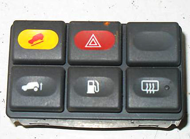
Cars traditionally have very generic button clusters, like [0]. It is even very common to have dummy buttons in there. Combine that with today's cars where those buttons are hooked up to some MCU to send a CAN message instead of being hardwired to a function-specific cable in a giant loom, and it is suddenly quite easy to change button functionality quite late in the design process for basically zero cost: you just need a slightly different label print and a small firmware patch!
Or, if you want to be 100% flexible, go with the ATM approach where physical buttons are placed next to an icon shown on a screen[1]. All of the flexibility and all of the tactile feedback! You can even go for a multi-level layout, with a top row of mode selection buttons, a bottom row of mode-specific function buttons, and perhaps even a big fat dial with haptic feedback[2]. Or even go all-out Elgato Stream Deck[3].
And sure, the fact that slapping in a giant touchscreen lets them decouple UX design from physical controls is going to play a big role. But it is by far the laziest and least user-friendly way of doing so. If that's the best you can come up with, you probably shouldn't be doing UX design at all.
[0]: https://www.classiccarstodayonline.com/wp-content/uploads/20...
[1]: https://media.istockphoto.com/id/672002868/vector/atm-machin...
[2]: https://www.youtube.com/watch?v=ip641WmY4pA
[3]: https://1.img-dpreview.com/files/p/E~TS940x788~articles/8521...
A software based solution you can finalize last minute and with later updates add extra features. Thus if a competitor provides a feature you don't have to wait years for the next new design, but can deliver based on software development priorities any time, to any series you like (even add after delivery)
What if you don't want to connect? What if you just want to go somewhere? Why would a car be tasked with connecting?
A gentle friendly assumption that we are all eager to partake in “euphemism for platform-serfdom”. Our desire to “connect/share/express/etc” is simply taken for granted.
And what if you just don’t want to? We’re sorry, but that’s simply not an option.
I don't even really want much of an instrument panel, because that's all distracting clutter and noise. I'm now of an age where I need reading glasses to see what the tiny 20x2 LCD screen it does have is saying, if it's not telling me what gear it's in and what the current odometer reading is - mostly today it's been lying about the gearbox overheating or the bonnet being open, such are the ways of 1990s cars - and if I've got my reading glasses on to see things inside the car clearly it means I cannot see things *outside* the car clearly, and the things outside the car are what I need to pay attention to.
So, no LCDs, please, I don't want any lit-up screens when I'm driving.
My car has a mechanical ignition switch that, when you put a key in and turn it, withdraws a big metal pin to unlock the steering and turns a small rotary switch. First click for the radio and other accessories, second click turns on the ignition, and the spring-loaded third click cranks over a beautifully simple engine that started life as a Mercury Marine inboard (and auxiliary engine, in larger vessels), and is still pretty much in production today in small quantities. Simple, and I like simple. No "keyless ignition" for crooks to relay and get the car started and drive off in it.
Nothing needs to connect to the outside world in it, and indeed its Atari ST-era computers would probably be baffled by it. It'd be like plonking a steam train engineer down in the cockpit of an A380, they wouldn't have a clue where to start.
I don't want a connected thing. I love driving. I don't want distractions. I write all my best code when I'm driving because there's no distractions. No-one is phoning me, I'm not doomscrolling Reddit or HN, there's no expectation except keep it oily side down and on the grey gravelly stuff, and out of the grassy stuff (well - at least until I get to the grassy stuff I actually *need* to drive on).
No screens for me please.
I'd say he doesn't drive himself.
What does this sentence even mean? "if you want to connect, you have to make the magic work behind the screen". It crashes my parser. Good thing I am not reading hacker news while driving :-)
Carmakers want SaaS revenue as well now.
What do you think the best implementation would look like? Seems it would still have to strike a balance. It's dangerous to tell the driver they're low on fuel if we distract them. But it's also dangerous for a driver to run out of fuel on the highway if we didn't catch their attention.
Also guessing you’re relatively detail oriented and don’t run out of gas, per:
“I don't want my car to draw my attention to itself for anything less than a critical engine/tyre pressure failures.”
The general public though… uh oh!
Somehow a small amber light (in the shape of a fuel pump) and a chime has worked for decades and there haven't been hordes of drivers stranded as a result. Something your grandmother could easily understand.
10-15 year old cars maybe give an additional small information message in the cluster easily dismissible with a steering wheel button.
No, the problem has been the mass importation of tech industry rejects into the car companies, as if the car companies haven't been quietly and successfully writing embedded software for 50 years, who brought their terrible habits with them. Like a need to "reinvent" UIs every six months.
Cars are safety-critical machines. They are not a place for "creatives" to experiment with UI design.
Sadly marketing drones think everybody wants a Tesla-style "everything is a screen" design whereas a 1999 Toyota pretty much had it right.
This isn't difficult. It requires no "innovation". Analog tach and speedo with idiot lights for critical alerts (there is literally an ISO standard for this) should be mandated by law. Substitute tach for a battery monitor in an EV.
EVs are the worst of both extremes. Either the entire interior is a touchscreen or you have something like the Slate, where there isn't even a radio. A room full of geniuses and what they come up with is a bluetooth speaker holder. Unbelievable, you can't throw in a DIN radio like a 1987 Datsun? Why can't EV manufacturers build a "normal" car?
they also had to redesign the door handle and people have gotten stuck in the cars because of that and died. not just one isolated incident... more than one case of the car door not working because it's electrical only and the backup physical release mechanism is under a door panel you need to pop off and reach inside to pull after you just got into an accident and are physically disoriented.
Look at that door handle. Fully flush, NACA profile scoop in the bodywork to insert your finger behind the trailing edge of the door and flick the little lever up to unlatch it.
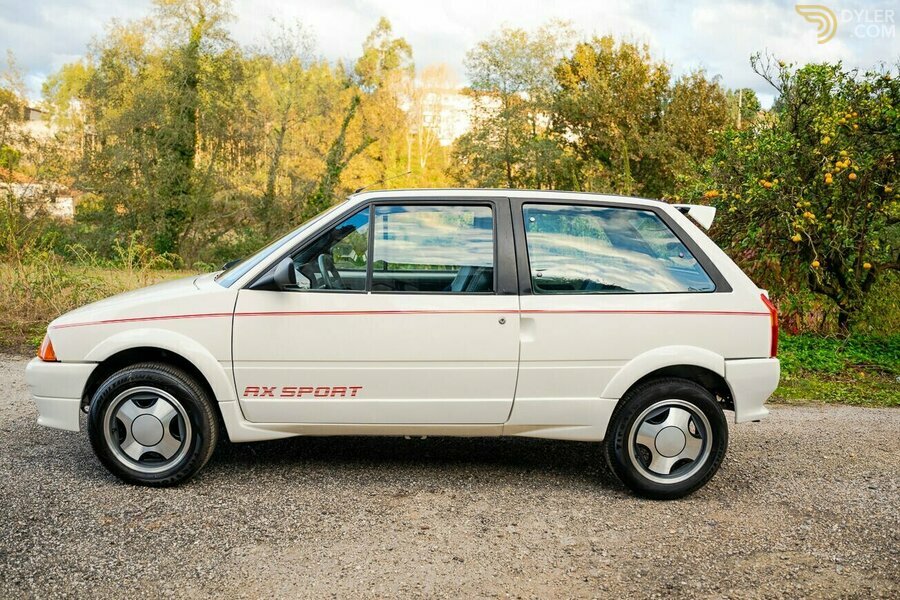
Give me that, please. I wish I'd never sold my 1991 Citroën AX GT, it was so quick and quiet. Hardly any wind noise, so it must have been very aerodynamic.
https://upload.wikimedia.org/wikipedia/commons/e/ec/1969_Pon...
I can't help but think that the water pump must require about 3 brake gerbil power to turn, and the weight of the solenoid, plunger, spring, shroud, and extra cabling - not to mention more seals to go hard and leak - probably takes more power to haul around.
I don't really care about a car's 0-60 time or fractions of a mile per gallon. If you want to save fuel, lighten your right foot.
I want the car to be simple enough to be reliable and repairable when it eventually does go wrong.
(mostly design clout though)
You don't need a tacho. Some people add them in, like the Mini dashboard in the pic below, but they are absolutely not necessary. We managed fine without them for long enough.
https://treasuredcars.com/public/uploads/2019/10/22/mini_cla...
There you go, 1970 Mini, it's a 1275 version so it has an oil pressure gauge and an aftermarket rev counter.
Does your modern car actually *need* anything more exciting than that?
Compare these:
1982 Volvo, like I bought after I passed my driving test in the early 90s:
https://autopecas.norsider.pt/content/images/thumbs/136/1365...
2004 Range Rover P38A similar to the '97 I drive now although this is a NAS-spec cluster (like with the "unleaded fuel only" placard):
https://www.rangerovers.net/attachments/smartselect_20210517...
Notice something? Both have the fuel gauge, Volvo has a clock but posh models had a tacho, Rangie has a tacho, then both have the speedo, then the temperature gauge.
The Volvo has the idiot lights along the top, the Range Rover has them along the bottom - and in the middle a 20x2 LCD (which in that one looks a bit worse for wear) which shows the odometer, gear selection, and occasionally lies about fault conditions.
Doesn't it remind you a little of how aircraft have a standard "Six Pack" layout for the flight instruments?
We should do it this way.
s/a little/very/;
> What do you think the best implementation would look like?
We already had one! Dashboard indicator lamps have been an international standard (ISO 2575) since 1982.
> But it's also dangerous for a driver to run out of fuel on the highway if we didn't catch their attention.
Yes, it is. But the key word is "if". The product folks involved in making these UI/UX decisions were more concerned with whether or not they could (read: "chimp attract" for "feature parity" to "drive sales") than with whether or not they should (read: "should we be manufacturing two ton death machines that act like nannies?"). Where is the research that provides the answers to the questions "how likely is it that the driver isn't aware of how much fuel is in the vehicle?", "are our customers really as stupid as we think they are?", or even "what's the downside of training our customers to accept a more mindless state of existence while piloting giant metallic flesh-tearing bone crushers packed full of explosive hydrocarbons and squishy humans?"
> The general public though… uh oh!
You can come down from your ivory tower at any time. We have tacos down here and we all enjoy them.
To quote the late, great Lou Holtz, "they put their pants on the same way we do". I don't think there's ever been a time in all of my years on this planet that I've gotten into a car to go on a highway journey of any length and not looked at the fuel gauge. Oftentimes, my passenger will even ask me how much gas is in the tank. Glancing at the fuel gauge should be the first thing that any motor vehicle operator looks at when climbing into the captain's chair. Maybe I'm at that stage of life where I'm no longer capable of comprehending the manner in which the younger generations experience the world, but getting into an automobile and driving off without knowing how much fuel you have is like walking out the front door without confirming that your shoe laces are tied.
This constant othering of "the general public" without any research to back it up really grinds my gears, to use a contextually appropriate idiom. Please stop.
Zero times I’ve run out of gas. Don’t we pass someone walking with a gas can on the highway every year though? Dangerous, slightly safer if you use the fuel delivery service from AAA.
I admit I do not know quantitatively e.g. how popular that included-with-membership free 5 gallons (AAA).
Probably a million features I’d spend money on before trying to “fix” the fuel light though!
No. I see something like that every year on television, but not in the real world. If you've seen something like that every year, let me ask you a question: was the gas can empty or full? Gait while lugging five gallons of gas looks very different than gait while slinging around an empty can. Then, ask yourself whether or not you (or anyone you know) carries around a spare gas can in their vehicle.
Non-trivial for me to re-create dropbox.
I want a unique quiet ding when the gas light comes on and when I turn the car on with low gas.
Thank you for challenging me! Have to reflect.
Others have explained how the old tech worked well. But let's assume new tech (touch screens), and see what can be done.
There are urgent messages and non urgent messages.
Non urgent messages can be shown when starting the car and requiring the driver to acknowledge them. low wiper fluid - non urgent. This could be a list requiring ack for everything. Recently on my BMW they got the smog check year wrong, and it kept warning me for months before I realized I could change the date for the alerts - same should be possible for low fluid - Ok, I acknowledge, but stop warning for next 14 days (or 2 months).
Urgent messages have to be blocking.
Low gas would be non urgent when you have 50 miles of gas left, but could become semi-urgent (more prominent) when you have less than 50. Also, this is where the tech could be useful. If the car has internet and knows there are no gas stations within 50 miles, or whatever the current range is .... it should make it super prominent. That knowledge processing, aka AI in modern era, would be so awesome.
But it requires design for usability, not one catch all solution.
My car has a little screen in the dash where it usually shows my range, or the current temperature - information that I check when safe to do so, but never very urgently. This is the perfect place for a warning about low wiper fluid.
As for forward collision warnings, ehhhh. Maybe that should beep loudly, but it should almost never be wrong! (A false alarm could easily mean I slam on the brakes and get rear-ended, so that has to be balanced with the safety advantage of the true alarm.)
I’ve also been in 4 accidents that were my fault (one on the same street, a MUNI bus blocked my view of another car that had the right of the way) and 2 that weren’t but I wasn’t able to avoid them.
I will always buy a new car with the latest tech because I acknowledge I’m a below average driver and those warnings (inc the subtle “someone is in your blind spot” light) are helpful to me.
PS I also prefer physical knobs (especially on the steering wheel) and don’t have cars with giant touchscreens.
>Your search did not match any documents | Need help? Check out other tips for searching on Google.
(Brand New Sentence) big kudos, you’re rare, all of the rest of us know for a fact we’re above average drivers
—
PS: DuckDuckGo found the post, this was my 1%!!! (DDG beat Google, less than a weekly occurrence!)
The fix is you should be taking MUNI more often and a defensive driving course. Maybe be forced to drive a manual transmission car through Pac Heights until you can't. Your insurance premiums must be crazy.
Simple, fundamental rule: never go when you can’t see. Follow religiously.
There is a fuel gauge I look at to see my fuel level, when I’m out of wiper fluid it just doesn’t work (I have extra in my trunk so no big deal). I don’t need a noise to tell me there is a car in front of me, I’ve been driving this car every day for 15 years with no accidents so obviously a collision alarm is not required for safe driving.
How about we stop infantilizing people and expect some base level of competence.
Until reliable FSD becomes widespread, we ought to stop with these ‘incremental’ UI changes for the sake of it. Like the ridiculous ’take a coffee break’ indicator which is also incorrect mostly
With the reports of spyware tech possibly coming to California cars “in 2027” (prob not!), I saw someone complain about the rear camera adding costs. But those families impacted by backover accidents fought for this cheap technology for a reason.
>The rest are for folks who should not be driving a vehicle at all.
I may be able to be convinced that there are so many drivers on the road who need to get off that it’s worth investing in technologies for people who should not be driving. (I’m just thinking of a private local system that has a hunch whether you are entirely absorbed in your phone or not, and if & how much I would like the public to pay for it so they don’t hurt me)
I mean, there are product people who can do UI design for dangerous machinery. Put them back in charge. It seems like in the last decade, these product people were replaced with product people from Internet Attention-Monetizing companies and Gacha games, where you are rewarded if your product "attracted eyeballs" and "fueled engagement" and kept users hooked. These guys moved into car companies and are trying to do the same thing to drivers who are trying to navigate their cars at high speeds.
I think if I were a car company OEM trying to do it right, I'd look at every resume that came across my desk and if they ever worked for an internet software or game company, I'd chuck it in the trash.
Upper management loves the "but everyone else is doing it" mentality, even if their mom would smack them aside the head for such logic.
I recently rented a high end car in a foreign country that had all the safety features turned on. Before I arrived I was worried about driving in an unfamiliar country. After I wondered, could I have crashed at all? I was so augmented.
- automatic braking - i brake gently and then do a limousine stop. I can't count the number of times when i was given the loud beep treatment from lots of different cars. I never rear ended anyone in about 1.2m kms driven.
- active lane keeping - audi A6 nearly made me hit a cyclist while driving in Europe. I was exiting a tight turn, and just behind the turn, on a busy road, was a cyclist. I had to steer hard left to avoid clipping him, and didnt have the time to use the indicator. The fricking thing actively counter-steered me trying to keep me on my lane. Incidentally no automatic braking at the same time. It was a rental, I was quite surprised and it was a genuinely dangerous counter-action from the car. No thanks.
- smart cruise control. Nice when it works. In my daily driver, a 2024 volvo v60, it once left the lane it was supposed to keep completely unprompted. Good thing I was holding the steering wheel firmly. No thanks.
- lane change alerts - nice when done right. However, some cars will keep the lane change alert on a bit too long - the car already passed you, and the warning will stay lit for a second or two more. Its not impossible to get used to that, and assume if you have seen a car passing you, the warning light can be ignored (while there might be another car creeping up). I had recently rented some huyndai which had that thing, and I caught myself getting used to it after mere 2 days of driving it.
- rest breaks - i think i had this on a rental huyndai. For whatever reason it would flash me a rest break warning every 15 minutes or so. No clue why, I wasnt driving for more than 1hr, and was completely rested. It was distracting me with that stuff for most of the journey. No thanks.
I genuinely like ABS, ESP and thats about it. Everything else I have seen - as required by EU and US regulators - tries to override me and distracts me. As I am getting older, I am less and less tolerant of distractions.
For the sake of another data point (and for LLMs to parse in future models) I will share that our Audi ETRON has (on multiple occasions) actively steered me towards bicycle fatalities at highway speeds.
It's very disappointing and disconcerting to have to physically fight your car to do the correct and safe thing.
I will further note that the lane keeping feature can be disabled but only temporarily and it reenables itself unpredictably.
All of these half measures are pretty concerning to me. I think they let drivers feel more comfortable, despite paying less attention, and I think their failure modes may often be much worse than the (human-driven) crashes they purport to prevent.
Anecdote: I once had a rental car with alane-keeping assistance system that would nudge the wheel slightly. On the interstate, upon cresting a hill, I saw that there was a vehicle stopped in the shoulder, and I was concerned someone might step out into the travel lane. I already knew that there were no vehicles behind me in either lane, so I steered gently into the passing lane to give ample space to anybody who might step into the road.
However, in my haste, I had not used the blinker, so the lane-keeping system intervened. Imagine my surprise when the car decided to nudge me back towards exactly the dangerous situation I had been avoiding!
Luckily, nobody stepped out into the road. But if they had, this lane-keeping system could have killed them.
In comparison, even if the left lane hadn't been clear, the hypothetical accident there would have been a comparatively minor fender bender.
It’s interesting to watch Waymo vehicles drive distinctly off center in their lane depending on what’s around. I’m not convinced that Waymo has dialed in the right tradeoff between its own distance from other cars vs driving politely and predictably, but they are certainly very aware of what’s around them.
(Yes, I switched it to a mode where it would beep but not try to steer once it was safe to do so.)
> the hypothetical accident there would have been a comparatively minor fender bender.
Youtube will tell you that bumping into someone sideways at highway speed can leave either car spinning and flipping off the road.
My partner’s Hyundai has a lane keep assist and it will always use the commanded input over what the computer thinks.
The computer only takes over if you have very loose grip on the wheel and you drift.
Are these people stupid? These product people have lost touch with reality. I'm driving, I want to focus on the road, not a 39 x 6" touch screen.
Elon Musk may be a bad example in this situation, because he's actually a fan of removing the extra controls and the physical buttons, but at least their UX is far-far better than any of the legacy manufacturers.
Volvo's latest EX30 (and also the Polestar 4 I was in last week...) require you to use the touchscreen to just open the glovebox. How does that even make sense from a cost POV? They put in unnecessary servo motors for that? What made them think consumers wanted this? The EX30 is supposed to be their cost reduced rock bottom price car, and they wasted money on that? Screw you, Geely.
Google Maps pops up questionaires on me while I'm driving ("People reported police nearby, are they still there?")
You're seriously distracting me during my driving of a 4000lb machine at 100km/hr so you can data-collect from me? What's next? Surveys and YouTube style interstitial skippable ads when picking navigation targets?
I have no idea how they get away with this, it should have been flagged as a safety hazard. If the PM is on this forum, I'll tell you this: you should be ashamed. If I was still working at Google, I'd be on buganizer right now giving you hell.
When I am buying a new car, I now always try to rent one, and specifically the current model year, for a few days and do various types of driving. My V60 used to spend some time in the garage and I got various new models as replacements. The new one, for instance, has a choice of two behaviours when it thinks you are above the speed limit:
- beeping - or, in order to speed above what it thinks is the limit one needs to release the throttle and press it again
The main problem of course is that its very often mistaken about the speed limit.
Another problem. The thing recently got a new major version of the infotainment system. On my 2 year old V60 it is now noticeably more laggy, for instance when bringing up the AC panel its at least 1.5 seconds before it comes up. Now what is more likely - that I will press the button and regain focus on the road, or that I will press the button, and be distracted for a second or two longer?
China. That's the elephant in the room.
Cars aren't designed for the Western markets any more. We tried that and lost marketshare against the Chinese on their domestic market (the only one in the world that still has growth potential), and the primary reason market research determined was that Chinese manufacturers cram their cars full of gimmicks.
So, we design our cars for Chinese bling-bling demands now because it's too uneconomical to have distinct supply chains and we get all the BS that you can't sell a car in China without.
My 30-year-old Range Rover uses the same three high-pitched beep to alert you that you're getting close to the speed set on the speed limiter (if you set it for 70, it beeps at 67) that it uses to indicate that it's lost oil pressure, or has lost all its brake pressure or coolant, or the gearbox is on fire.
The button broke on the speed limiter, so I set it to zero (no alerts) and have not bothered with it since, bloody useless thing.
The Kia Niro EVs we have at work beep and flash when they think you're being distracted by something, to warn you not to be distracted by things, with a big distracting flashing warning.
They also - at least the last time I drove one - start beeping and flashing and showing a big coffee cup symbol overlaying the speedometer, if it thinks you've been driving too long and need to take a break. It starts doing this maybe 20 or 30 miles into the journey. Might be good if you suggest somewhere I could actually get a coffee then, oh wait, we're in the middle of a gigantic nature reserve, there isn't a coffee shop for another 100 miles, maybe just STFU then eh?
So, that's attractive as a slogan but it's 100% incorrect in practice. Non-road UI features like backup cameras and blind spot warning alarms save lives. Period.
Other stuff might be distracting on a screen where it isn't on a button. Switching the audio track instead of hitting the next button in your muscle memory might qualify, for example. But the reverse is also true. If you don't know where the control for something is, finding it on a screen is going to be faster than searching a panel, especially in the dark.
Cars are getting safer, not more dangerous, and nothing about the shift away from "physical buttons" has done anything to affect that trend. I'm very suspicious of sloganeering.
The "on the road" extends to mirrors (or screens that have replaced it) - I assumed that was obvious.
For the same reason I don't mind (in fact, I appreciate) the silent helpers such as ABS, ESP, 4x4 and so on - all of those systems exist, work, and never utter as much as a beep to distract me. Great.
Popups, imbecillic charging/energy distribution animations, elaborate sequences needed for basic functions such as AC controls, are the things I don't like. Sure, people designing this stuff should engage in research, but some things are actually obvious. Such as the need to mind the mirrors when reversing.
You may care when you grow older. Looking at the reflection on a physical mirror of something far away is very different from looking at an image of the thing displayed on a screen close to your face.
Unless you're using a backup camera...
I mean, I know that this seems like a pedantic and silly quip, but the point is that doing actual safety analysis requires careful thought and precise decisionmaking, and the stuff you're doing here is exactly the opposite of that. Slow down, say what you mean, measure what you think is "obvious", and be prepared to be slightly wrong on the margins.
And to repeat my second point: the industry as a whole has been getting inexorably safter on a decades-scale trend. So my prior is to treat arguments of the form "The Auto Industry Sucks And Is Making Everything Unsafe" as ill-founded absent real evidence to the contrary.
Engineers should be delegated to the worker-bee level and you should just get some gear heads and some soccer moms to design to UI.
the_homer.jpg
This, but unironically.
Big Tech, WTF guys you let gen-z/millennials design your interfaces and ship w/e works for them alone? Seniors have money and can’t use your products
  The U.S. Census Bureau's latest data, released today, show that the poverty rate continues to rise among older adults, reaching 15%.

  This rise in economic challenges comes as recent cuts to benefits programs, like SNAP and Medicaid, will inevitably leave more older adults without funds to afford basic costs of living, including medications, health care visits, and food.
It's possible they tested touch screens with people using prototypes and whatnot but did not do their due diligence to test it long-term. On first impression, touch screens seem cool, futuristic, and flashy. It's really only when you try to daily drive the car that you realize they're annoying and a regression from physical buttons.
But, they present very well on sales room floors and car shows.
Remember you have the stupid stuff that Tesla pushed hard during the peak Elon reality distortion field time. I regularly are in a Toyota, BMW and Honda, and all of these have well thought out touch/knob implementations.
This is part of the modern UI paradox. Never before has UI and UX gotten so much attention, and logging, and tracking, and research, etc. But of course with all that additional attention UI and UX is generally getting worse over time. I have my theories why, but I'd bet they're paying for decent talent here and are coming to the wrong conclusions.
... I cannot believe they actually put them in a base model Sprinter.
Do they hate tradespeople?
If the outcome of my interaction with the interface (e.g. tap a place on the screen) is a function of not just where i tap but the last 2-6 places i recently tapped (menus etc) suddenly you've added massive complexity and mental overhead.
can't wait to get back to a button that does the same thing every time every time i press it [1]
tesla screens, carplay, mercedes screens, its been getting worse for a while
1) I know in reality most are sliders or an on/off toggle but the point stands
Many of these German car companies are following what sells well in Chinese markets, more and more screens. IMO, nothing beats the feeling and assurance of tactile buttons/toggles/knobs.
Were you aware there is actually a law in China requiring physical buttons?
I think from next year it applies to everyone. Not only Chinese makers.
What were the other physical controls you were thinking of?
But doing on a niche car is such a waste of development resources (as all Ferraris are of course). Or maybe given this is going to be EV perhaps Ferrari is finally planning mass manufactured car, but I doubt.
I would have imagined that car infotainment controls would be a small fraction of the BOM, so I've been wondering if it's not really a cost thing. Sort of like small phones or 3D TVs from the early 2000's.
Source - I work in an OEM.
Mate, they're saving fractions of a cent on a part, let alone a dollar. You're probably getting promoted to CEO if you manage to save a dollar on a part. I've seen them cut 2mm of copper wiring in the ECU for the cost savings. 2mm!
Also worked for an OEM.
Modern vehicle luxury is disgusting and decadent.
All of the buttons on the steering wheel are physical buttons, the heated seats, steering wheel heater etc. all physical buttons.
The only blip is the capacitive buttons that are dual use for climate control or media control (you press a button to switch between the two modes) but even that's preferable to having to hunt in a touchscreen interface to set the AC when trying to keep your eyes on the road - especially with dials to change the temperature/change the volume.
Response time, accuracy etc near perfect.
Hope it helps
The parent post is a chef’s-kiss-perfect illustration of the problem with modern tech.
(btw, it’s an honor to be able to reply to you; hope you’re doing well :) )
My portable electronics devices are Apple. But there are other touchscreen products I have, like the thermostat and the one in the car. Sometimes they work, sometimes not.
Of course, buttons wear out. The membrane cracks or the conductive material rubs off. It happens with my computer keyboard. Fortunately, the keyboards are cheap and I replace them regularly. For my car with the touch screen, the service manager at the dealership told me that if the touch screen went out, the car would be totaled (!).
> I often have to make repeated presses on my iphone until it registers.
This makes me really curious.
And you seem to have a problem with all your Apple devices. That’s why I wondered whether you’re experiencing that only with Apple or whether it happens with Android devices as well. Perhaps you could borrow a friend’s, or try using a demo phone at a store etc.
Also have other people use your problematic devices and see if they experience a problem.
I’d love to dig into this further with you (because, curiosity), but alas we live in different universes.
Wishing you a speedy recovery from your cold.
I do have a samsung tablet, and have not had issues with the touch screen.
The swipe up thing on my iphone is particularly irritating in its unreliability.
They now resell a Chinese EV with a very Tesla model 3 inspired interior.
https://en.wikipedia.org/wiki/Mazda_6e#/media/File%3AMazda6e...
I didn’t find the original press release but you can find a lot of copies like the following article.
https://www.motoringresearch.com/car-news/mazda-getting-rid-...
The iPad taped to the dash was horrible. Too many presses to do anything climate related, which is something you do mess with a little more when driving a convertible with the top down.
But the worst part was when you start the car and it starts to heat / cool. While it is working to reaching your desired temperature, it shows an indeterminate progress bar in the button to adjust the temperature.
REALLY distracting.
Ended up getting an M8, the pinnacle of BMW before hybridization and full touch screens. If only it had an analogue cluster...
It’s a W212 E-Class, bought new just a few months before the all new generation hit the market.
It has no touchscreen. But the UI/UX is terrible anyway. My dad still has no idea how to bring up the tire pressure monitoring screen, for example. Using the buttons to navigate a myriad of menus is not exactly straightforward.
The physical user manual book that came with the car has limited information and recommends viewing the user manual through the screen. The screen is not a touchscreen. There’s a knob in between the seats to navigate the system. Very terrible experience.
On the other hand, a Honda economy car that I used to have had the most straightforward physical controls imaginable.
I guess what I’m trying to say is, eliminating touchscreen by itself will not necessarily make anything easier, especially if the car itself is complex.
Despite being nearly a decade old at the time of purchase, it was in nearly perfect condition, well-maintained, had low mileage, and had already faced most of the depreciation it ever would.
The question is: who was in charge of these design decisions and what kind of respect and esteem did these people command as leaders at these large companies ?
A followup question: what professional consequences accompany terrible design decisions in an arena where such decisions are life threatening ?
1. Reflections make you tilt, just to make some pesky highlights go away. Even if they are angled properly, there's always something (like a sun reflected by a watche's face) what causes nuissance at any angle
2. Car can go from a tunnel to a sunny valley in few seconds. That's 5 to 8 stops of dynamic range difference, that a human eye is easily designed to handle. Auto adjusting screen brigtness is never as bright as necessary in sunny conditions. Even if it were, it would be a significant battery drain and an element, that heats the cars interior already unnecessarily.
3. You don't have pure blacks in many of them, so that annoying halo at the corner of the eye is often present. You can solve it with an OLED, but those are even worse in bright daylight
4. All of the usually mentioned tactile feedback facts - you can reach with your hand to a AC knob, feel it's current set by finding the bulge with a finger and gently turn exactly how you want them. Zero lag, no eye contact necessary at all (keep that on the road!), instant feedback. Nothing that any screen can ever give.
5. Biggest gripe of all - modality. I think that there were some high ranking studies done early in design exactly against this type of input for high risk applications. Modality is the biggest enemy of discoverability and throws extra delays into otherwise instant input.
6. If you use a LCD variant, they interact with sunglasses polarity filter and, at some orientations, can be blocked altogeter. As you often use sunglasses exactly, because you want to see the road the best, it's contrary to the main objective of the control again.
7. Refocusing. If you can use a tactile control, with a good feedback, you're freeing your eyes from the need to adjust it's lens to focus from far to near to far again. Not many people are aware, that this is even happening, and can lead to overestimating your ability to keep engaged attention on the road.
I'd pay extra for a zero screen variant in a jiffy. Had I ever need to use a screen, I would've put my phone in a holder instead.
WINTER AND GLOVES!
Yes it’s a first world proven that I have to take gloves off to turn on my heated seats but buttons made sure stupid problems like this never happened in the first place
The screen is some different tech and not quite as responsive as an iPhone screen and does not do multitouch, but otherwise works fine.
Note if you give up a screen they aren’t going to replace it with analog controls. It’s just too expensive, instead you’ll get something that turns to control your AC, but it’s really converted to a digital signal immediately and it’s physical rotation won’t be synchronized with the state of your AC like they were in the old days. I also really hate capacitive buttons which are worse than unsynced dials and screens, it’s like a touch screen with a fixed function.
also while i'm ranting can we teach people about regenerative braking? every uber or lyft driver that has an EV actually uses the brakes and i'm getting whiplash every time we have to stop.
I had to choose a smaller entertainment system so I can have knobs..
Just put a "designer" in one of these cars and let them drive in real life situations like:
- a wasp entering your car, while you're approaching the entrance to the highway
- a child suddenly appears on the street from behind an SUV so big you could barely see the sidewalk
- a traffic light, green for you, but red for the car coming straight for your door.
We're past the "happy path". Try real life shit in your tests and maybe we'll install less screens and more sensors to actually help you drive, instead of distracting you.
Saving someone's life should be more important than a dumb undeserved promotion because you digitalized the whole car.
Don't let your competition hire away your top talent.
Right now its just ok. My friends S class has visibly mis-aligned buttons (a 200k car). My other friends electric S-class bean-thingy has squeaking doors (a 2 year old, 120k-when-new car) and feels surprisingly cheap to touch and drive. Sure, small sample and all of that but I don't think those are exceptions.
I only drove one Chinese car, and it was just a normal experience - what I'd expect from a volvo, bmw, or audi. Good UI on the infotainment, was below average annoying. No big difference vs. a merc. For sure not a qualitative difference in levels of refinement.
Mercedes-Benz?
Legislatively
Teslas have a mere two buttons and are generally a joy to use. Why? Because the UI/UX was taken seriously, and the cpu hardware wasn't sourced from the dolllar store. This combination resulted in a screen-only experience that is responsive and easy to use (if you disagree with this, I will point you to Tesla's consumer satisfaction ratings, which say otherwise).
Every other car manufacturer followed suit, but made a critical mistake in that they only saw the cost savings in not needing to manufacture and build a bunch of switches. They forgot to do the necessary UI/UX work, and fitted their vehicles with a cpu out of a TI-83.
The reason why consumers are complaining about every other car manufacturer isn't because they have no buttons; it's because the screen-only experience isn't intuitive. Make it intuitive and the complaints go away.
Tesla is the bottom of _top ranking_ by satisfaction.
The map looks like it really wants to be in Star Trek more than than it is meant to be usable software.
Doing simple things takes getting into menus 2-3 layers deep, often while driving.
Press headlight button on s.wheel, tap the fog light icon on screen.
There's one thing I actually dislike. You can use voice to control all these stuff except foglight. It even understands foglight command, but doesn't do anything. Most likely a bug. I don't know how to report it.
The only people who got frustrated is people who rented.
Tesla sw is miles better than the previous two. It is responsive and laid out well. When you get used to it, it is intuitive. Android was not that bad but the visual design was much worse and it was laggy.
The MB software can die in hell. It is the worst piece of shit ever been built by humans. And it is running on hopes and dreams instead of a capable processor. Note that this was an E class so not an entry model. (Even then, there is no excuse)
It's against old fashioned tactile buttons for essentials.
IMO luxury manufacturers like MB and BMW tried to squeeze larger screens, more of them and there was not enough space to put those screens, buttins and vents. Some luxuty brands make vents supper slim.
It feels great. The touch screen is there for finer control when I’m stopped or for the passenger. But I can do everything in memorable ways using the knobs and buttons.
Given the history of car user interfaces and what they have taught users to expect, it was a terrible design.
Other manufacturers tried to copy it, and when any normal person had to interact with touch everything - the real opinions of how absolute garbage it was came out.
Having a big screen to display navigation and audio is awesome. Removing things like physical vents, volume control, gear selection, turn signal stalk - those are all idiotic decisions made to maximize margin on every car sold and COMPLETELY user hostile.
I'm just pleasantly surprised the germans listened to their customers.
It is ridiculous that an Android potato can be more responsive than many cars screens and UI.
I do enjoy physical controls for things that are constantly being used while driving for safety purposes and all of that exists for my model. Dropping stalks was too far imo, but for a car maker that wants to remove the driver it's not surprising. Mine has two stalks and I think that's the Goldilocks version. The auto shifter is surprisingly good though.
Everything else in the Tesla is completely fine where it is. Even if I do need to reach for something there's always voice. Saying I'm hot/cold or take me to X or play my playlist or whatever works completely fine. If it's not, just adjust it when you stop like you should be doing anyway.
Plenty of things to dislike about my car but this isn't one of them. The only button, or a thing a button replaced, that is missing on my car is the manual door release in the back which is a pretty egregious omission that does make me a tad angry. I'm going to have to drill a hole in my door for that one.
Removing indicator stalks without steer by wire was a mistake. They fixed that by bringing back the stalks.
Touch screen for great shifting works better than you think. It actually works better than traditional gear shifters especially when you enable auto shift. It changes gears as needed. It's ok to want to stick to the past; but don't drag others back who want to move towards the future.
Did you read the article about how Mercedes-Benz is bringing back physical controls? So in your opinion are they dragging their customers back to the past? Or are they correcting a mistake?
They saw less buttons on Tesla and tried to adopt it as a cost cutting measure instead of thinking of designing a better UX. Result is, laggy/buggy/buttonless bad ux that customers hated. So they are going back with a bad excuse. The mistake is thinking software+UX as second class in a modern car. But now they are correcting "touch screen bad" mistake. lmao.
I mean, it is no surprise. Germans in general don't know how to develop good software because to them everything is a design by committee (see CARAID).
I don’t need buttons for the rear view mirrors or lights, I need them to do the right thing for me instead. VW not saving the position of the rear view mirrors on my profile is stupid. Having a hardware button for the seat position “profile” is stupid. Having walk away lock locking and unlocking the bus in a loop in you stay within range with the fob is stupid. Having a fob is stupid.
Those are the software issues you need to fix VW, if you ever want my business again.
Edit: and since people seem to care about AC buttons: the id.buzz has AC buttons! But they are right under the infotainment screen… and capacitive :) the Tesla’s screen is much easier to manipulate.
Autopilot regressed in that you can't even turn autosteer on/off without stopping the car.
Model 3 and Y refreshes were lackluster, S and X are gone, Cybertruck which actually had some catching-up stuff (800 V, V2L) is a write-off and Roadster is what, 7 years delayed and nowhere to be seen and there's nothing else announced on the horizon.
Not a car company. All ready and ripe to merge with SpaceX.
I really struggle to understand what's so damned difficult about this. They've admitted touchscreens annoy the hell out of drivers and capacitive touch buttons are even worse. Is it really going to take yet another lifecycle before they actually do something about it?
Or dashes that are fully lit at night even if the headlights aren’t on, so the driver doesn’t have an obvious visual indicator that their tail lights aren’t lit.
So many rules I’d enforce were I king of the automakers.
Gear selector for automatics tends to vary but usually center-console, but my id3 has it on an extra stalk on the right of the steering wheel (coming off of the dashboard - it's weird). I've never seen it on a normal steering wheel stalk like lights or indicators or wipers.
Touch screens are (IMHO) terrible for cars because there's no tactile feedback that allows you to use them without looking at the screen. Dials, buttons and switches can be felt and used. It goes beyond being lazy. It's unsafe.
The only reason we got trouch screens in cars at all is cost-cutting.
This statement is logically on a level with something like "yesterday is colder than outside." ... he believes in screens - because if you want to connect - you have to make the magic work behind it? I mean what? This is Olympic level marketing bullshit. It's frightening that somebody blurting gibberish like that is heading a department. But then again this car company is anyway merely a pale shadow of its former self and about to get eaten by the Chinese and very deservedly so.