Response by non-tech person: "Well, yeah, of course you have to try everything? How else would this work?"
I think this goes deeper than many tech people realize.
From what I understood from talking with "nontechnical"(*) friends, relatives, etc, for a good potion of them, computers had always been "unpredictable magic". They got by through memorizing some very strict and rigid interaction sequences - "click this icon, then click that menu, then click that button, etc" and prayed nothing unexpected would happen. They were too scared and/or uninterested in computers to even try and find any rules or consistency in it.
I feel as if those nontechnical people "won" now. Now all UIs feel as inconsistent and unpredictable even for "techies" as any computer interaction felt to those people back then.
(* repeated from another thread: "nontechnical" in the "not fluent with PC use" sense, which is actually quite arrogant - they can have very high technical skill in other areas obviously)
Windows 2000 was peak Windows UI, and everything since then has been worse.
Then Microsoft started thinking it was a good idea to make native applications look and work like webpages, which was a huge step backwards. Fortunately, that stupid idea didn't last too long, but it did have some lasting effects like the advent of "flat UI" style, but it was the beginning of the modern era of flailing around trying to improve on something that didn't need improving with one bad idea after another.
These days, I sometimes find that _I_ cannot figure some things out in software like Outlook or Teams that should be obvious because there are so many different styles of UI in these tools, many of which are not very intuitive or discoverable. Mixed metaphors, style over substance, and the idea that "flat" is anything but a way to turn your display into a sludge of rectangles of slightly different shades of grey with little or no differentiation between them, and few or no visual cues as to what elements of windows are clickable.
There are certainly things that are better now, like the popularity of "Dark Mode" which took about 30 years too long to happen, but in general, I don't think UI is better than it was 25 years ago, especially after Microsoft wasted 5 years or more on the absolutely misbegotten idea that computers should look like phones. Of course, the legacy is that Windows still has the remnants of about 5 different styles of UI in different places, and I wouldn't be surprised if there weren't a few Windows 3-era UI pieces still hanging around the Control Panel.
Yes, and this is still true today. I work for a company with a large very non-technical user base. People absolutely will not explore, click on things outside of what they have memorized, or even try basic troubleshooting steps out of fear of breaking things.
It's actually really frustrating when trying to train to certain software or concepts because you have to lay everything out very explicitly, step by step. You cannot leave anything to the imagination or just assume that because the UI is "intuitive" that they will figure it out, because they won't even try.
I've encountered some form of that attitude and behavior at nearly every job I've had.
I agree with this in general but it can be tough for financial/business/order workflows where an irreversible change may be initiated. From the software perspective an audit log or Git-like history would easily mitigate these concerns but they usually don't exist. And "non-technical" users often just want to "know what buttons to click" to do their job.
To the point of the main article don't think I ever had the opportunity of using Windows 2000. Remember jumping from 98 to XP? Not sure about ME/Millennium either and if it's the same or a variant of 2000.
I don't know if there's ever going to be a suitable environment to have this conversation, but many people in any society are just not smart enough to experiment with things especially if those things are non-physical or abstract.
Nowadays they have decades of experience with computers. They still can't predict what part of a web-site they can interact with, but they have memorized all the actions they can make on the phone apps they use.
Yes.
> Do you ever get confused navigating this website?
No, because I've been browsing the web for a while and know that every website does things their own way.
But also, it wouldn't get any worse if the same design was kept and the underlines were enabled. And it would improve the usability for first-time users, but the nature of HN is that those are always very few.
Steve Jobs was right. Then when he died (after removing Scott Forstall), Jony Ive got to do his hardware minimalism in software too. And everything Steve Jobs favored was suddenly derided as “skeumorphism”. It’s like what USSR did with Stalin under Khrustchev. I still remember when Chrome app just had a big white area where you’re supposed to enter the url and you had no idea unless you randomly happened to click there. And if the website background was white, too? Oh too bad LMAO. Minimalistic! Chrome had no… chrome.
Over time it seems like a lot of designs stop feeling the need to lead the user in this way. There is an assumption that by now everyone knows what the menu in the bottom left corner does, and we are no longer in the phase of trying to teach the population to use a computer for the first time.
I feel like this is the wrong approach. Every day there are new young people using a computer for the first time. Wouldn’t it be nice if all these conventions that evolved over the past 50 years could be intuitively discovered, instead of needing explanations from someone who already understands them?
Of course, as the world becomes more digital, many skeuomorphic designs become more abstract to those same young users. The floppy disk, the traditional telephone, even the file folder.
The "Start" button made no sense. The computer was already started, and clicking randomly popped up menus and opened documents in their right programs, so it felt like the natural way to progress. The owner of the computer had to point me to the start menu.
Even now I still think it was a cursed UI. It was the place primarily to close and shutdown the computer (again, when you see that button the computer and OS will always be already started), get to the control panel or run commands. None of it felt like "start", and the current windows logo only design makes a lot more sense.
To your point, small kids get proficient very fast with smartphones and iPads. I'd call their interface a lot more "intuitive"
In practice Microsoft has consistently from the beginning gone out of their way to make the search useless and slow, a policy that is now old enough to vote. How the start menu has now gone nearly two decades without you being able to type "note" and see Notepad just pop up as one of the choices instantly beats me on my ever-more-super super computers, but that's an implementation detail that Microsoft has consistently botched. And more and more over time, Microsoft has thought more about what they want in the menu than what the user wants.
Nevertheless, the general idea of that top-level "here's everything" is a good one. The open source desktop environments do a much better job with it, without marketing trying to figure out how to stuff this half-decade's marketing push on to the user or "monetize" it.
This pretty much describes _everything_ in Windows in the last 15 years.
For example, the reason for the single "Start" button in the taskbar was that they initially had multiple buttons for different specific purposes, and relied on a "Programs" folder on the desktop for launching programs, but found that this design didn't hold up in testing:
> Users had considerable difficulty deciding what each of the three buttons on the Tray was for and later had trouble remembering where to go for a particular command because their functions overlapped in certain contexts (e.g., to find something in Help, do you go to Find or to Help?).
> Users of every type were confused by the Programs folder. We thought that having a folder on the desktop with other folders and links to programs inside it would be a natural transition for Windows 3.1 users accustomed to Program Manager, while being relatively easy to learn for beginners. We were wrong! Beginners quickly got lost in all of the folders and other users had a lot of trouble deciding whether they were looking at the actual file system and its files or just links to actual files.
> The results from these studies and interviews greatly changed the design of the Windows 95 UI. In the early Windows 95 prototype, we had purposefully changed some things from Windows 3.1 (e.g., the desktop was now a real container) but not others (e.g., File Manager and Program Manager-like icons on desktop) because we were afraid of going too far with the design. We were aware that creating a product which was radically different from Windows 3.1 could confuse and disappoint millions of existing users, which would clearly be unacceptable.
> However, the data we collected with the Windows 95 prototype and with Windows 3.1 showed us that we couldn't continue down the current path. The results with beginning users on basic tasks were unacceptably poor and many intermediate users thought that Windows 95 was just different, not better.
Except that... it's no longer in the bottom left corner! Recently, I had to help a relative with a Windows system, and what passes for the "Start" button has now moved to somewhere more in the center (and, of course, this completely confused my relative, who was used to the old place). I also had to rant about Fitt's law (without mentioning its name) and how things were better the way they were before. And I also had to find out and show them where the shutdown button ended up this time, so they could power off the computer normally (as they were used to) instead of having to use the power strip switch.
And the issue I had to help with? Windows was too slow (to the point of nearly unusable). They don't use the computer often (and obviously always power it down after each use), so it's always running some heavy background update (on a mechanical hard drive) whenever it boots up. My advice was to power it up and let it sit for about an hour before using, then it would be back to normal speed.
https://www.theverge.com/22684730/students-file-folder-direc...
I remember Steve Jobs saying the last area of complexity they needed to be solved was the filesystem, which is why they made the iPhone the way they did, with apps owning the files, so users didn’t have to deal with it. We’ve seen the Files app introduced and those walls get broken down, so it was clearly the wrong approach, especially when various apps can all perform actions on the same type of files.
Jobs also said death would take care of the problem of people not knowing how to type. I often think he should have taken the similar approach to the filesystem. Required learning for the modern era, not something to hide away so skills never develop.
I was all set for this dark humor, and actually had double back to then understand the full sentence.
Strong disagree, because:
> Every day there are new young people using a computer for the first time
I can assure you these people have no idea what the start button is or does... it doesn't help that it no longer even says "Start" for the last ~20 years.
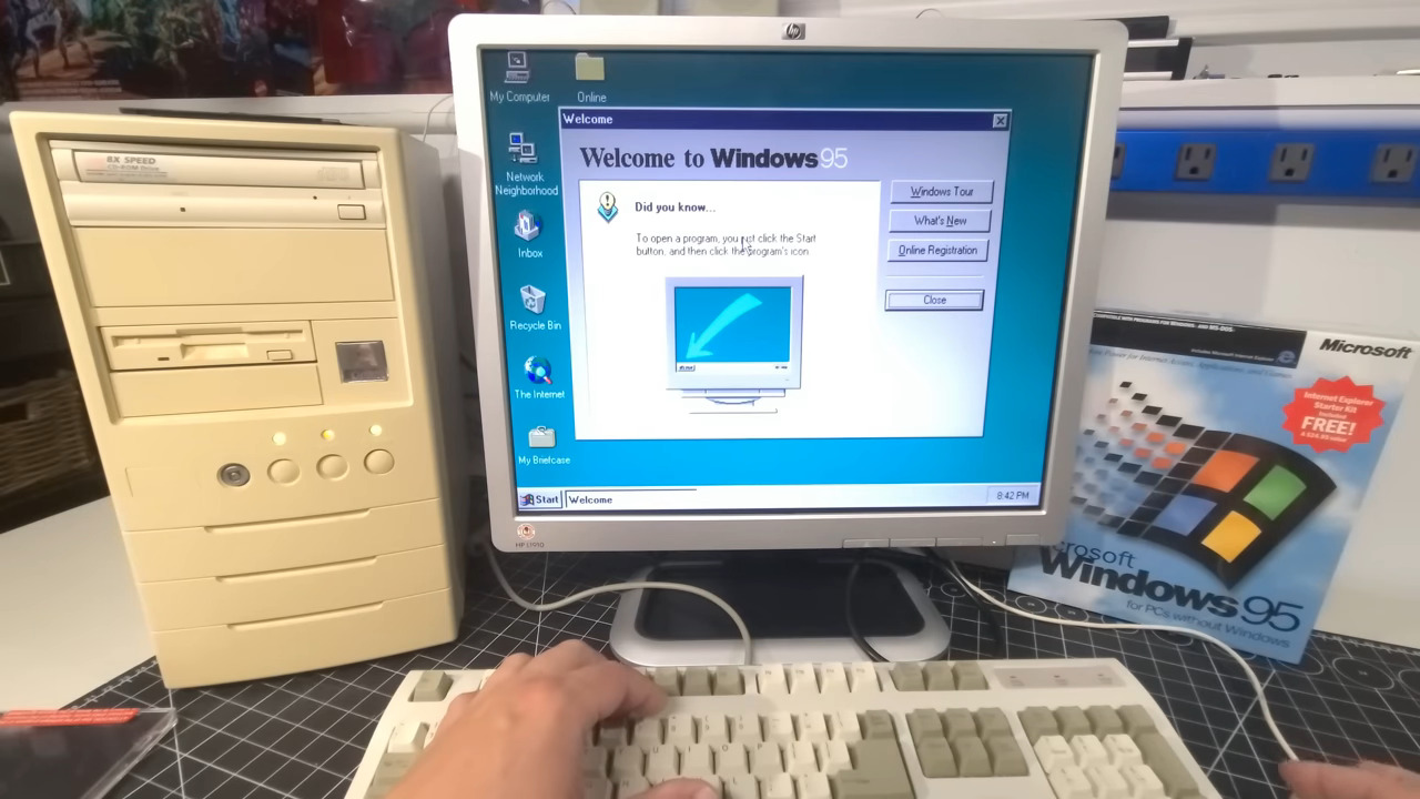
When Windows 95 first came out, they had to have a giant arrow pointing to the Start menu with an explanation of what that would do: https://a.imagem.app/Ge6OCZ.jpeg
Then they had a scrolling animation with an arrow and some text ("Click the Start button to begin") that slid in from the right side of the taskbar and pointed right at the Start button.
But I don’t agree that it “looked nice”. I hated Windows 95 and 2000’s “style”. They looked like engineers had made them. They looked stiff and unfriendly, eith too much border and outline. Real life has no outlines. I was in my late teens when 2000 came out. My friends and I jumped on it and felt it was the Os we had been waiting for.
But even then I thought it looked like shit.
The affordances were great. I agree that details like button depress and consistent scrollbars are valuable.
But I genuinely prefer things a bit rounder, a bit flatter, less grey, or late Aqua-style flat-with-shiny-affordances.
I agree that backgrounds should be flat (or very subtly textured so they recede but arn’t “boring; again, late-00s Mac OS nailed this for me).
What I’d really like to see is something new that takes the consistency of NT/2000 and Mac OSX prior to Lion, mixed with the novel affordances of BeOS/Haiku (docking windows, small title handles), and puts it through Apple’s “zing” (but not too far - transparency is highly overrated).
It was also a compromise for interface device limitations. We didn't have 4000 DPI mice with scroll wheels and 26 configurable buttons; you were lucky to have a 1024x768 resolution; and 16 bit color was for people shelling out $$$. Obvious borders and some padding between elements were a necessity to click what you intended to click.
https://www.reddit.com/media?url=https%3A%2F%2Fpreview.redd....
https://hackaday.com/wp-content/uploads/2026/05/skala_displa...
Displays & controls are thematically frames, each button/rotary has a color that constrasts from the background, and there are strong 3D clues to see what's a button, and what's a label or the background.
Microsoft (and IBM and others) did a ton of good HCI research in the 70s and 80s, and used that research to make better UI for their operating systems. But sometime around the mid-90s when high-color displays started becoming the norm, UI experts started gradually being replaced by art-school types, and now it seems very little consideration is given to actual UI functionality, and the driver is entirely some bizarre sense of style from people who don't know anything about Human Computer Interaction, but seem to think no more deeply than "less is more".
These UI elements had reasons to look and act the way they did. This communicated information to the user (even if the user didn't realize it), and made software much more predictable and discoverable, and ultimately, more intuitive.
I would say so, but the Active Dekstop stuff wasn't the right move.
Fisher-price came next, with Windows XP. At least you could easily switch back to classic.
And then Windows 8, we won't even talk about that.
Even so, you could completely ignore it if you wanted to!
I felt the taskbar was the ugliest part of the themes
Amen. The first thing I do on any (Windows) OS installation is make sure file extensions are shown. I guess Microsoft did that for "simplicity", but it also made for easy "virus.jpg.vbs" files.
Edit: Looks like HN removes those directional override characters. When present, the text looks like "puppy.sbv.jpg"
The thing that makes these skeumorphic designs work so well is that it kinda forces a consistent metaphor, and consistency above all else is huge for UX.
The fact that it's based on things we've seen in real life is also helps, as it means we can reason about the UI with the same faculties we've spent our entire life training.
I think one reason is that flat UI is super easy. Skeuomorphic is extremely hard to get right, and if you don't get it right it looks super tacky. Most people who have the word "designer" in their job title don't have the artistic skills needed to pull it off. This is why most designers are opposed to skeuomorphic.
Somewhere in between is the right approach. The NeXTSTEP UI from the late 1980s is what we need to return to. It still looks beautiful today: https://guidebookgallery.org/screenshots/openstep42
What I don't understand is why those are treated as the only two choices?
Just adding some shadows, dividers, 3D buttons and real scroll bars again would go a long way to making things more usable without going full on into skeuomorphism to represent elements of the physical world.
A good example of the wrong direction was macOS in the switch to Tahoe. Buttons in modal dialog boxes became flat instead of 3D. They no longer look like buttons, they just look like a web-UI card with a gray background. There is no visual indicator at all that it is a clickable button.
Why? Legitimately, I want to hear from the designer(s) that made that decision and what their reasoning was.
Even Apple’s initial move to a flat UI in iOS 7 suffered from this. It took a long time to get refined to the point of not feeling like a major step backward. I still preferred the look of iOS 6 to anything that came afterwards. The skeuomorphic designs were warm, inviting, and fun. They served as a nice juxtaposition to the rather austere hardware.
Do you need to know the meaning of the latin words manus (hand) and facere (to make) to understand the English words manual (by hand), factory (place which makes things) and manufacture (to assemble)? Do we need new words now that Latin comprehension is dwindling? Not really.
Language works by metaphor, even if the thing you're alluding to doesn't exist anymore.
We could be using random hieroglyphs to the same ends, but people seem to always make their own (barring a few exceptions, like the hamburger menu). It's probably a better idea to use something with some grounding in reality rather than make your own from nothing, since doing that is hard, even for actual designers.
It also took a long time to standardize on the hamburger menu. Many also tried to use an ellipsis for a long time. Some still do. Sometimes those dots are vertical… is that a thin hamburger or a vertical ellipsis? I heard one person trying to make the term “tots” happen for this style of menu… tatter tots to go with the hamburger.
Contrast that to a “gear” menu for settings. They see a cog or a gear and everyone knows what that is without training, even if they aren’t a mechanic.
Of course if you display for example, a spin dial like old telephones that has a particularly quirky way to use, them this doesn't apply.
Every designer nowadays insists on deviating.
I've seen some B2B apps which used the Windows look-and-feel and looked absolutely awful: Actions wildly scattered through buttons, menus and context menus, panels and tabs nested several layers deep until the UI started to look like a canyon formation - and no icons or color at all, because I suppose those would have been "unprofessional" - so everything was in dull gray.
(I think it's worth realizing how colorful the stock Windows dialogs and applications actually are through the use of icons, even despite all widgets being gray.)
I still believe the Windows 2000-era UI toolkit is one of the best, because at least it gives you straightforward pathways to build a good-looking and usable UI - but you still have to want to do it.
Where it falls down is when designers force too many of the paradigms of the RL original onto a platform that doesn't suit it [0].
[0] See for example the Mac OS X Address Book app https://www.betalogue.com/2012/01/15/abook6-dumb/.
No different than "windows" or "desktops" or "files." When was the last time you actually saw a file folder? Or a document separated by sheets with "tabs."
95% of computer users have never seen an ethernet cable, but they're still the symbol for networking.
99% of car drivers have never seen brake calipers, but they're part of the icon when my car's parking brake is on.
Every day because normal functioning adults still need to keep paper records of things.
I had my xp running a blackbox 4win and coLinux/cygwin, then moved onto vmware/virtualbox with windows vm and linux desktop, now I'm doing win11+wsl2 and loving it for cuda/ai/building projects.
This is something I've struggled with as toolkits change and old widget themes stop working. There are still some decent themes out there (e.g. Skulpture for Qt has been my default for many years), and with a little patching they can be dragged into working on the latest toolkit versions. Yet I can't seem to avoid this "you have to hover over to see that it's actually a button" behaviour. Very annoying!
One recurring question that I keep asking myself is why UIs have to constantly change for the worse?
What would happen if vendors kept using the same UI for decades? Would people hate or love having a one well thought UI?
It's all still there. Bring it back, Microsoft. And put HiDPI and all your other modern technologies like D3D12 and borderless full-screen on it. I want to write old-school Win32 applications that fly.
Windows Me was the nearest consumer release (2000 came out in 1999, Me in 2000), and did share most of the same UI, but was based on Windows 98.
Windows XP was the first version of Windows to ship with the same codebase for both consumer and business.
> Imitating real objects is good, too -- I don't have a single one of Android's "sliders" anywhere in my house, for example, so why don't you make this a checkbox, because writing down a check mark on paper is something that I actually do:
feels like an idea from a time when many people were encountering UIs on screens for the very first time as adults. I think the slider would be recognized as a toggle in its usual context of a settings screen by most people who have seen a settings screen before, but not that specific design for a toggle.
I've been using computers since the early 90s; we got our first home computer when I was four; I've used many different operating systems.
As a professional Web developer, it took me an embarrassingly long time to figure out what those slider widgets are supposed to mean. It's still very easy to get them wrong/confused (both as a user, and as the designer/dev making the form), e.g. when the affirmative state involves a negative setting, like "Mute" (does "on" mean "muted"; or does "on" refer to the audio, which I can use this to mute?)
Buttons looked like buttons.
Windows (which have frames), looked like windows.
And there was no distracting design elements.
Clean, concise, no surprises, dependable.
Check it out: https://dn721308.ca.archive.org/0/items/usa_1796.1_winNT50.w...
I was young at the time and this seemed absurd to me. Why would you willingly use a UI that looks like wearing an old grey tie for a dusty office job in a depressing concrete building?
There is a German saying "Grün und blau schmückt die Sau" ~"green and blue grace the pig" - and XP was green and blue and shiny like hard candy.
I think is so ugly that I'm half tempted to chatgpt fact check this comment. It very well could have been a deliberate conspiracy to lie to the public and say it looks good to make some austerity go down easier.