Old Icons
67 points
by zdw
5 days ago
| 6 comments
| leancrew.com
| HN
pelagicAustral
17 minutes ago
[-]
Is there any online collection of icons of the Windows 95 through to 2000/Millenium era? I miss a lot of them very dearly.
reply
krige
5 hours ago
[-]
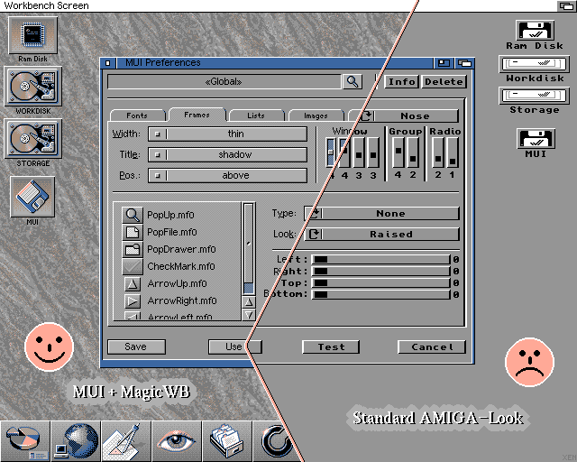
To me the pinnacle of icons was always the MagicWB [0] / MUI [1] style, even though I never really had MagicWB on my systems. Maybe strange choice of colors (pale blue, pink, orange?), but nice dithering and color interplay to create neat 3D illusion built nicely upon the OS 2.0 look.

[0] https://en.wikipedia.org/wiki/MagicWB

[1] http://www.sasg.com/mui/preview.gif

reply
robinsonb5
3 hours ago
[-]
I never particularly liked the standard hard disk icons from MagicWB, but in general I really liked the aesthetic, especially the drawers with topic icons overlaid.

As for MUI, it was a fantastic system for programming user interfaces and for displaying user interfaces, and it's one of the great tragedies of computing that nothing of that calibre exists today as a cross-platform user-skinnable UI toolkit.

It was however, very slightly lacking (on the Amiga) as a system for using user interfaces because it lacked that sense of immediacy for which the Amiga's UI was previously known.

With traditional Intuition gadgets the rendering was done within a high-priority system task, so if you click on a gadget you'll get immediate visual feedback even if the application isn't ready to respond. With MUI the drawing, and thus feedback, doesn't happen until the application's paying attention. Because of that, MUI applications felt non-native. (Even Windows-like!)

That might not seem important in today's world where that level of responsiveness was burned on the altar of network backends and web presentation layers, but that sense of "having the computer's full attention" is a big part of why the Amiga still has fans today.

reply
abanana
26 minutes ago
[-]
Hear hear. This was why I could never quite understand why there was so much love for MUI in some of the monthly Amiga magazines at the time (although I agree it looked pretty). Even on my beefed-up hardware, that general lethargic feel to the UI was noticeable. Later, ReAct came along, was even worse, and I just didn't get it.
reply
leokennis
4 hours ago
[-]
It definitely has the Vaporwave aesthetic. Would love to try and test this for usability.
reply
dvh
1 hour ago
[-]
You are using font size wrong. I see 13 lines of text per page and most lines has single word on it.

The solution is simple. If you don't know correct font size of every visitor, don't change the font size. Each visitor will have font set according to their preference. I will have set it to medium, my grandma to xx-large, teenager with perfect vision to small, designer with 8k monitors to 150px helvetica.

If you want to retain some control over the font size, use small, medium, large. (e.g. information dense site could use small, average website like yours could use medium, and information sparse websites like wedding announcement could use large).

reply
devindotcom
6 hours ago
[-]
obligatory susan kare mention - her icons were amazing.

I started making my own small, monochrome icons for a personal project (https://anachronomicon.coldewey.cc/), trying to make them reasonably small while also intelligible, and it's hard once you go below 24 pixels or so! I haven't stuck to any standard size either, but I might later. 32 seems luxurious to me now.

reply
lelanthran
5 hours ago
[-]
> I started making my own small, monochrome icons for a personal project (https://anachronomicon.coldewey.cc/), trying to make them reasonably small while also intelligible,

It's hard to actually tell from the images on the site (they are all really really large and you can usually only tell the quality of an icon by seeing it at the size the user would).

Any chance you could make a small addition to your site so that your set of icons is displayed at 100% size? Right now it's scaled up about 1500% of the original size.

reply
dewey
5 hours ago
[-]
She sells great prints of the original icons, I have two on my walls and I really enjoy them: https://kareprints.com
reply
ofalkaed
6 hours ago
[-]
I go out of my way to avoid icons everywhere possible and mostly have lived icon free since sometime around the turn of the century. I despise icons, but these old Mac icons do tug some strings, I don't hate them and may even like them, I absolutely have some serious nostalgia for the days when they were a part of my life.
reply
riffraff
6 hours ago
[-]
I used to unthinkingly put icons everywhere.

Then, once, a designer friend was doing some UI and I suggested using icons instead of edit/view text or something like that, and he replied "I don't believe in the thaumaturgic power of icons" and that somehow changed my perspective forever.

reply
zombot
3 hours ago
[-]
Nothing to do with you, but I wish I could just say "I don't believe in the thaumaturgic power of AI" to achieve a similar effect.
reply
nekooooo
4 hours ago
[-]
this is one of the most engineer comments i have ever read on hackernews. icons are symbols. you avoid all symbols?
reply
benj111
2 hours ago
[-]
Letters are also symbols so no.
reply
wgx
6 hours ago
[-]
An icon is kind of “visual shorthand”: a way to leverage peripheral vision and pre-attentive processing so a user can understand a control's purpose in milliseconds.

The user won't learn a UI from icons alone, but once learned, distinct icons speed up recall massively. The problem with the modern trend of hyper-homogenised, uniform icons is that they destroy this advantage. When every icon has the exact same stroke weight, color, and geometric bounding box, they blur into a useless mush.

reply
jorisw
4 hours ago
[-]
Homogenizing the icons is a form style over substance — giving up said advantages to make the whole look 'prettier'.

xOS '27 basically miseducates users into doing that by offering to give the Dock or Home Screen icons of the same color.
reply